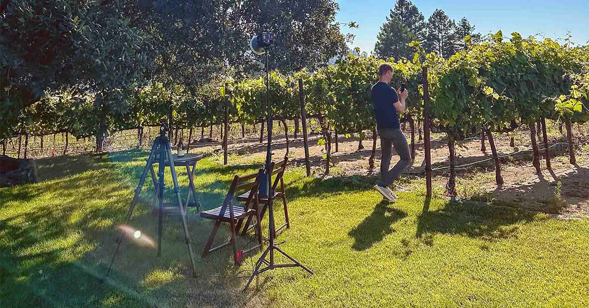
How pairing imagery gets made, behind the scenes
Outshinery’s partner for food styling and pairing photography.


Most people assume a pairing image is one photograph. Food and packaging, same table, same camera, same afternoon. That is how it used to work, and it is why pairing imagery was slow, expensive, and locked to whichever product happened to be in the room that day.
Outshinery splits the shot in two.
The food is photographed for real. Real ingredients, real light, a real stylist deciding where the pomegranate seed goes. Nothing about the food is generated or simulated.
The packaging is not photographed at all. It is built as a 3D model from the brand's own label file, then composited into the scene and lit to match. The glass, the closure, the foil, the fill line, all of it comes from the model, not from a bottle someone shipped across a country.
Two consequences follow, and they are the reason this exists.
Your product is exactly your product. Not a similar bottle. Not a stand-in. Not a bottle a generative tool redrew while it was inventing the frame. Your label, your container, your closure, placed into a photographed scene without being altered.
The image can exist before the product does. A brand can have a finished pairing image while the liquid is still in tank. Beverage teams know exactly how useful that is when a listing date lands before the bottling date.
One food scene, photographed once, becomes an accurate image for many brands. That is the economics of it. The craft is what makes it hold up.

Creating food for the camera
EAT Creative is a bespoke, remote, full service photo studio serving artisanal food and drink brands. Danielle Acken is a professional food photographer. Emily Lycopolus is a cookbook author and head of research and development. Aurelia Louvet is a food stylist and also a cookbook author. Between them they have written and photographed eight cookbooks, with recognition from the Gourmand Awards and the Taste Canada Awards.
They are the right match for this work because food built for a camera is not the same as food built for a plate. Danielle puts it plainly: there is an artful difference to "creating food for a camera as opposed to pretty food."
The recipes are invented for the pairing, not pulled from a stock library. Emily develops them with the drink in mind from the first ingredient. The presentation is then arranged to be flawless through the lens. As Danielle says: "The photographer is only as good as the food stylist they work with."
That recipe development is why a Recipe Pairing ships as more than an image. Each one comes with a print-ready PDF card, double-sided, carrying the recipe on one side and the featured product and producer on the other. Measurements are provided in both imperial and metric, which matters more than it sounds like it should when a brand ships to more than one market. Wine clubs put these in shipments. People stick them on the fridge, and the brand stays in the kitchen long after the bottle is empty.

Layers of expertise
Look at the collection EAT Creative built for Outshinery's clients and the mood is doing work. That is not an accident. Color, texture, and ingredient are all chosen with a specific drinker in mind.
"I play with the flavors and try to ensure that whatever we are creating works with the wine," says Emily. "The wine always comes first."
"My background is in chemistry, so many of the research books I use to ensure pairings work are science based. I do my best to treat my kitchen like a science lab, and that allows me to be creative within the perimeters of what the client needs."
For a beverage brand, a pairing image is a depiction of how the product will fit into the homes of the people who buy it. A bottle does not sit on a barrel. It shares a table with food, friends, and family.
There is psychology in the styling too. "You also need to mirror what the color tones mean to people," says Danielle. "You could have a blue, but people in California connect with blue in a different way from the people in the Pacific Northwest or people from the East Coast."
"There's so many layers and levels of goodness that goes behind it," says Aurelia.

It is not only wine
The collection started with wine, and the quotes above reflect that. The method does not stop there.
A pairing scene works for any beverage that gets consumed alongside something.
Beer. A saison next to a cheese board. A stout next to a chocolate dessert. Beer pairing is a live conversation in taprooms and on shelf talkers, and most breweries have no imagery for it.
Spirits. A cocktail is a pairing on its own terms. The glass, the garnish, and the bottle in one frame is among the hardest shots to get right physically, and among the easiest to keep consistent when the bottle is a render.
RTD and cider. These categories live on lifestyle context. The can or bottle in a picnic scene, a patio, a cooler, tells a buyer where the product belongs before they read a word.
The food is photographed once. The container is composited to match your packaging, in your format, whether that is a bottle, a can, a bag-in-box, or a pouch. A cider brand and a spirits brand can work from the same photographed table and each walk away with an image accurate to their own product.

The spectrum, from photographed to rendered
Pairing work is one point on a longer line. Outshinery's Pre-Designed Imagery spans a range, and the useful way to understand it is by how much of each image is photography and how much is render.
At one end sit Ready-to-Use Photos. These are straight photography with no render in them at all, and no specific product featured. Charcuterie, oysters, a table set for a dinner party. They are royalty-free and available immediately, built for the moment a brand needs a good image for a newsletter or a social post today and does not need its own packaging in the frame.
In the middle sit Recipe Pairings and Lifestyle Images. Photographed scenes, real environments, with your rendered packaging composited in. A Recipe Pairing centers a dish developed for your drink. A Lifestyle Image places your product in a real-world moment, a table, a kitchen, a vineyard, an outdoor gathering. Lifestyle Images carry three-month regional exclusivity by default, so a neighbor down the road is not running the same scene the same season.
At the far end sit Beauty Shots and Portfolio Images, which are render throughout. A Beauty Shot goes close on the label to show foil, embossing, deboss, and die cuts, the details a brand paid for and that a straight pack shot flattens. A Portfolio Image presents a full range in one composed frame.
Every one of these requires a Product Shot first. The Product Shot is the 3D model of your packaging, and everything downstream reuses it. One render, then every scene after it.

Which one do you actually need
Work down this list. Stop at the first line that matches what you are trying to do.
- You need any of the below. Start with a Product Shot. It is the model everything else is built from, and nothing downstream can happen without it.
- You need a good image today and it does not need your bottle in it. Ready-to-Use Photo.
- You want to show your product being consumed with food, and you want a recipe your customers can take home. Recipe Pairing.
- You want your product in a real-world moment without a specific dish attached. Lifestyle Image.
- You invested in foil, embossing, or a die cut and your current images do not show it. Beauty Shot.
- You need your whole range in one frame for a trade deck or a distributor catalog. Portfolio Image.
- Your packaging is unusual, or you need a POS display, a shipper, or a video. Custom-Made Content, which is a briefed conversation rather than a library pick.
Two things worth checking before you order anything. First, that your label file is print-ready, because the render is built from it and file quality sets the ceiling on the result. Second, whether you have a date coming, a listing, a release, a wine club shipment, because the whole point of building the container as a model is that the image does not have to wait for the bottle.
Why this matters on a digital shelf
Before a buyer reads a tasting note, they have already formed an opinion from the image. A product shot on white proves what the packaging looks like. A pairing image proves where the product belongs.
Most beverage brands have the first and not the second, because the second used to require a food shoot, a stylist, a studio day, and physical product in the room. That is the execution gap. Splitting the shot closes it.
FAQ
Is the food in these images real, or is it generated?
The food is real and photographed on set by the EAT Creative team. Nothing about the food is generated. The container is the part that is built in 3D and composited into the photographed scene.
Do I have to ship a sample bottle or can?
No. Outshinery builds the container from your label file and a verified 3D model of your packaging format. No physical sample is required at any point.
Can I get a pairing image before my product is bottled?
Yes. Because the container is rendered rather than photographed, the image can be finished while the liquid is still in tank. Brands regularly use this to hit a listing date or a sell sheet deadline ahead of bottling.
What is the difference between a Recipe Pairing and a Lifestyle Image?
A Recipe Pairing centers a dish developed specifically to go with your drink, and ships with a print-ready recipe card in imperial and metric alongside the image. A Lifestyle Image places your product in a real-world setting without a specific recipe attached, and includes three-month regional exclusivity by default.
Does this only work for wine?
No. The same method applies to beer, spirits, RTD, and cider, across bottles, cans, bag-in-box, and pouches. The scene is photographed once and your packaging is composited in, so the image is accurate to your own format and label.
How is this different from using a generative AI tool to add a scene around my bottle?
A generative tool redraws your product while it generates the frame, so the label, the color, and the finish drift away from your real packaging. Text is where it fails most quietly, scrambling type or shifting an ABV in a way that looks plausible on a quick glance. Outshinery places a verified 3D model of your packaging into the scene unchanged, then an artist matches the light to it. Fidelity by construction, not by correction.
Is this available through Outshinery Lite?
No. Pairing and lifestyle imagery is Studio work, produced by trained 3D artists. Lite produces bottle shots on a transparent background only.