Vodka branding and packaging: standing out when the liquid can't
Updated guide for vodka and spirits brands ready to stand out in the AI era

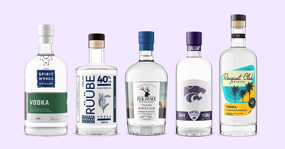
Vodka has a differentiation problem no other spirit has. The liquid is distilled toward neutrality, so on a shelf of forty near-identical bottles, the packaging carries almost the entire argument for choosing yours.
That has always been true. What changed is where the shelf is: your bottle now has to win in a liquor aisle, a search result, and an AI assistant's answer, all with the same design.
This guide covers what separates the vodka brands that get picked up from the ones that get passed over: the market they are competing in, the design cues that still work, and the digital assets that make them visible.
The vodka market in 2026
Vodka remains the largest spirits category in the United States at $7 billion in 2025 revenue, according to the Distilled Spirits Council's annual economic briefing. It is also contracting: revenue fell 3% and volume slipped 2.2% to 72.5 million nine-liter cases.
A category that is shrinking but still the biggest on the shelf is the hardest kind to compete in. The same dollars are being fought over by more brands, and the fight is happening on visual terms.
Flavored and botanical expressions keep widening the lineup, sustainable packaging has moved from differentiator to expectation, and direct-to-consumer channels reward brands whose visuals hold up outside a retail aisle. These packaging trends all point the same direction: the bottle is doing more of the selling than ever.
How AI assistants change vodka discovery
A growing share of buyers now start with a prompt instead of a search bar. Ask ChatGPT or Gemini for a smooth craft vodka under $40 and the answer arrives already curated: a short list of brands, tasting notes, and where to buy them.
AI tools assemble those answers from what they can read and see: product imagery, metadata, consistent naming, and the story published around the bottle. A brand with clean, well-described visuals on every listing is one a model can confidently recommend.
A brand with three mismatched photos and no alt text is invisible to that buyer, no matter how good the vodka is.
How the image was made now matters too. A render of your actual bottle and an AI approximation of one are treated differently by the disclosure rules that took effect in 2026; CGI vs AI: what beverage brands must disclose maps them by jurisdiction.

Branding fundamentals that still matter in 2026
Story comes first. Vodka buyers want the why behind the brand: who makes it, where, and what it stands for, not just a provenance line on the back label.
Visual consistency is what turns that story into recognition. The bottle on the shelf, the render on your ecommerce listing, and the image an AI assistant surfaces should be unmistakably the same product.
Outshinery Studio builds spirits imagery from your label files and bottle specifications, so every channel shows the same bottle, down to the fill line.

Packaging trends defining vodka in 2026
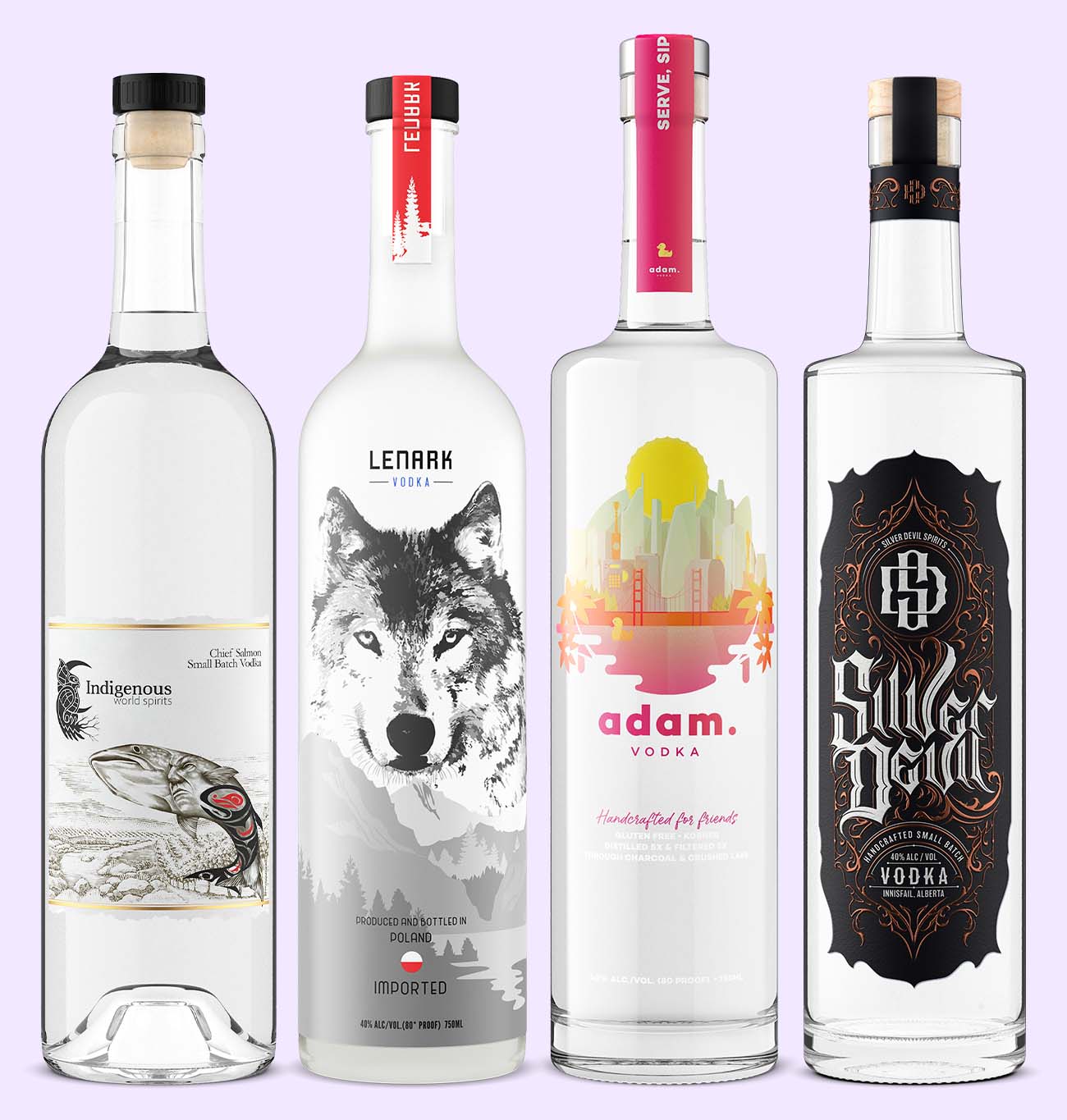
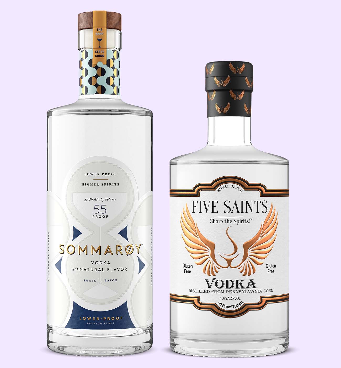
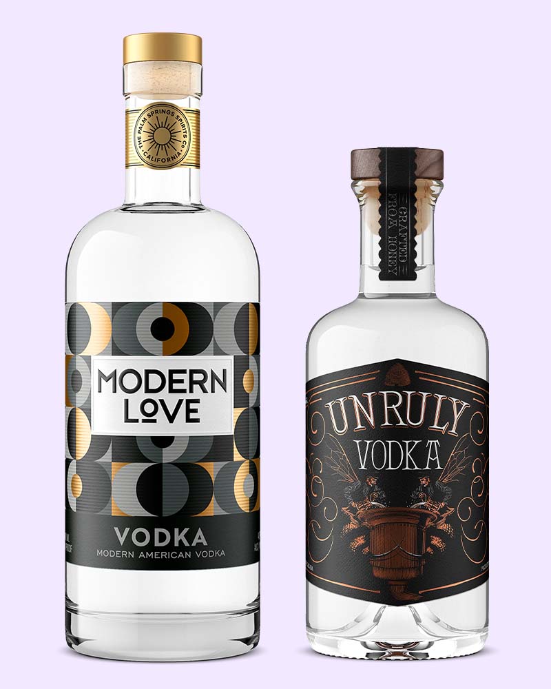
Sculptural bottles are doing work that advertising budgets used to do. Tapered necks, geometric bases, and softened shoulders stand out in a lineup, and they photograph well, which matters twice: once on the shelf and once in every image of the bottle a buyer ever sees.
Sustainability has become a purchase filter rather than a bonus. Lightweight recycled glass, compostable paper-based closures, and vegetable-based inks are now standard moves, with dry molded fiber bottles emerging behind them.
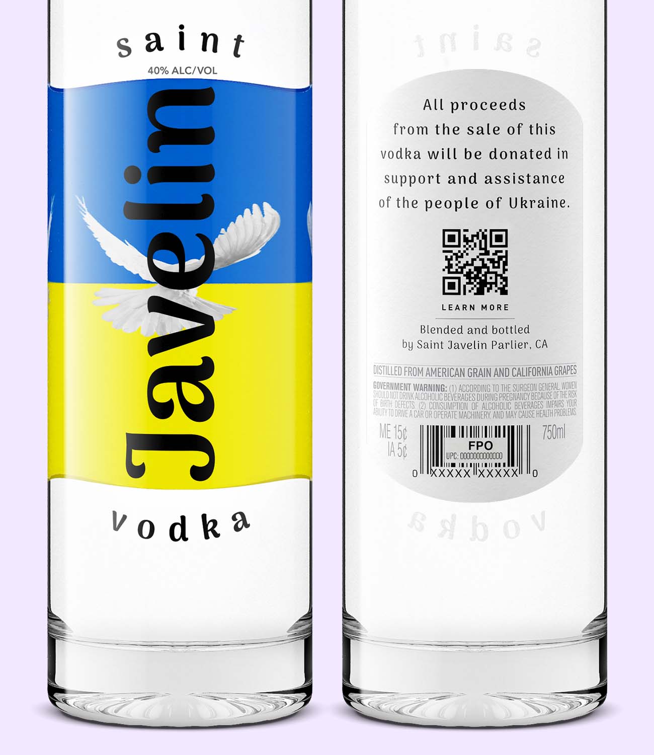
Smart packaging extends the label. QR codes and NFC chips carry the story the label itself cannot hold, from sourcing detail to cocktail builds.
And restraint reads as confidence. Minimalist design with clean typography communicates premium quality precisely because it declines to shout on a crowded shelf.

Label design: clarity, craft, and character
A vodka label gets one glance to signal purity and character before the eye moves on. Typography, hierarchy, and empty space do that signaling, not the paragraph of copy.
Sans-serif faces read as modern and pure. Serif faces borrow heritage and refinement. Metallic foil and embossing add the tactile cue that justifies a premium price before the bottle is even lifted.
A photorealistic render lets you see the finished bottle before your first production run, so the label's impact gets tested before you commit to printing plates, not after. That is the difference between a design decision and an expensive reprint.

Photography and 3D visualization for vodka brands
Product imagery now works for two audiences at once: the human deciding whether your vodka looks worth $40, and the algorithm deciding whether to show it to that human at all.
For people, that means crisp lighting, accurate glass and liquid, and a legible label. For machines, it means descriptive filenames, alt text, and metadata that say what the image shows.
Spirits product photography built to both standards does the two jobs from one asset, and consistency across the full product line compounds the effect with every SKU you add.

The rise of low- and no-alcohol vodka
The better-for-you shelf is backed by real numbers. IWSR estimates no-alcohol analogues, including no-alcohol spirits, grew 9% globally in 2025, and 40% of buyers choosing no-alcohol spirits name a healthy lifestyle as the reason.
Branding in this segment sells intent, not absence. Soft palettes, purity cues, and mindful packaging tell the buyer this bottle is a choice, never a compromise.
The brands winning here avoid making alcohol content the headline at all. They brand the ritual and the occasion, and let the ABV sit quietly in the fine print.
The future of vodka branding: 2027 and beyond
The vodka shelf keeps splitting into a physical half and a digital half, and the digital half is growing faster.
Expect AI-summarized tasting cards to stand in for the back-label blurb, bottle scanning that opens an interactive brand experience, and rapid virtual tests of label variations before a limited edition ever gets printed.
The brands that will define the next era are the ones treating the bottle and its digital twin as one product, designed together.
The bottle carries the brand
Vodka branding and packaging are not design exercises. They are the channel through which a liquid defined by neutrality communicates identity, which is why the bottle deserves the same rigor as the distillation.
The design of your product should be as clear, pure, and memorable as the vodka inside it.
Vodka also sits inside a wider spirits picture. For how premiumization plays out across the whole category, read how distilleries build premium spirits brands. And for a category that leans on heritage cues where vodka leans on clarity, see crafting distinct whiskey identities.
Frequently asked questions
What makes vodka premium?
Premium vodka is defined by ingredient quality, distillation method, and often a distinctive origin or flavor profile. Brands that emphasize local sourcing, authenticity, and modern distillation techniques earn the premium label because the whole experience, packaging included, backs the price.
How are vodka brands becoming more sustainable?
Vodka brands are adopting packaging made from recycled and lightweight materials, cutting water use, and moving production to renewable energy. The most visible shift is on the bottle itself: lighter glass, paper-based closures, and inks that compost instead of contaminate.
Why are unique flavors and ingredients important in vodka branding?
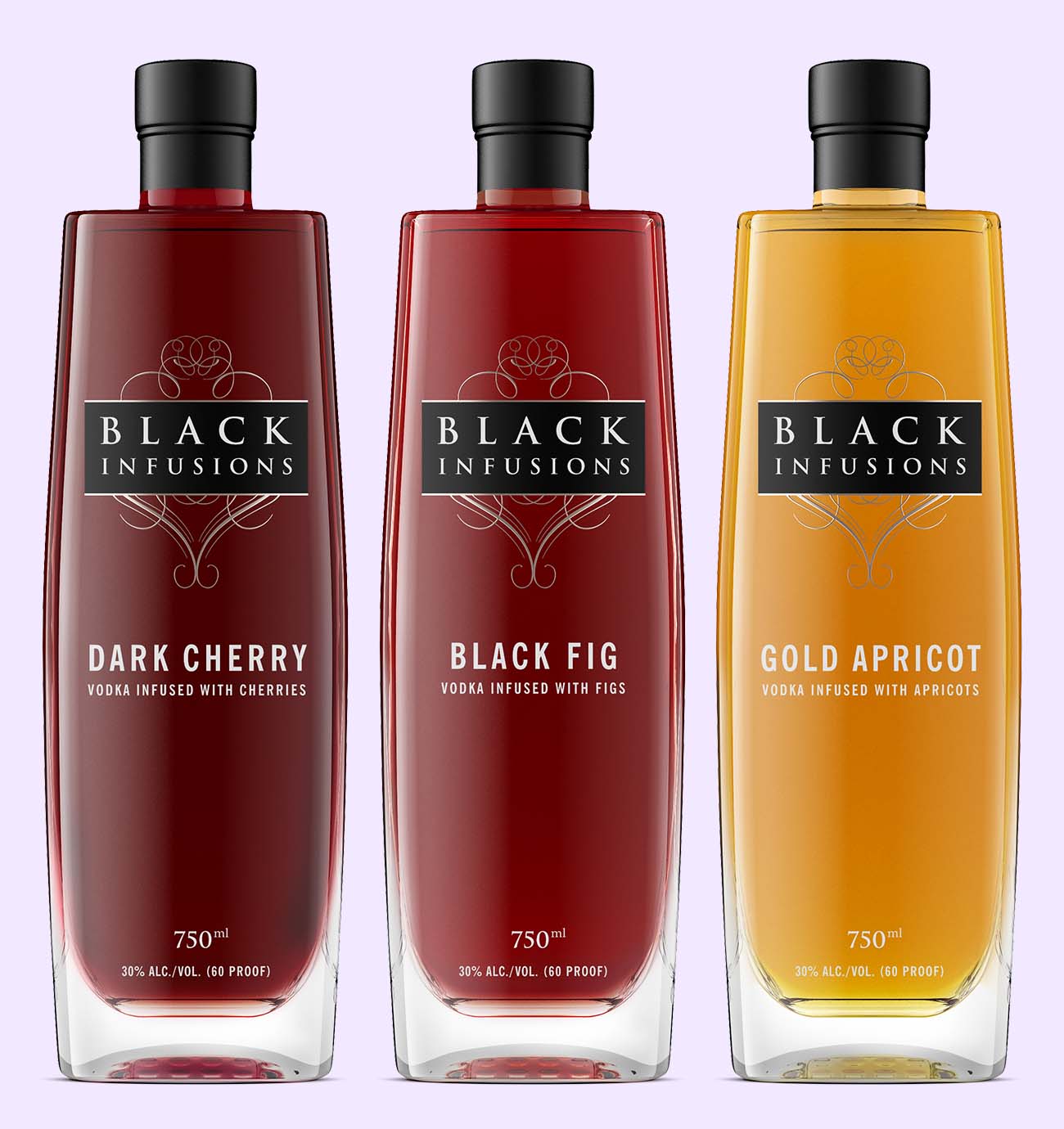
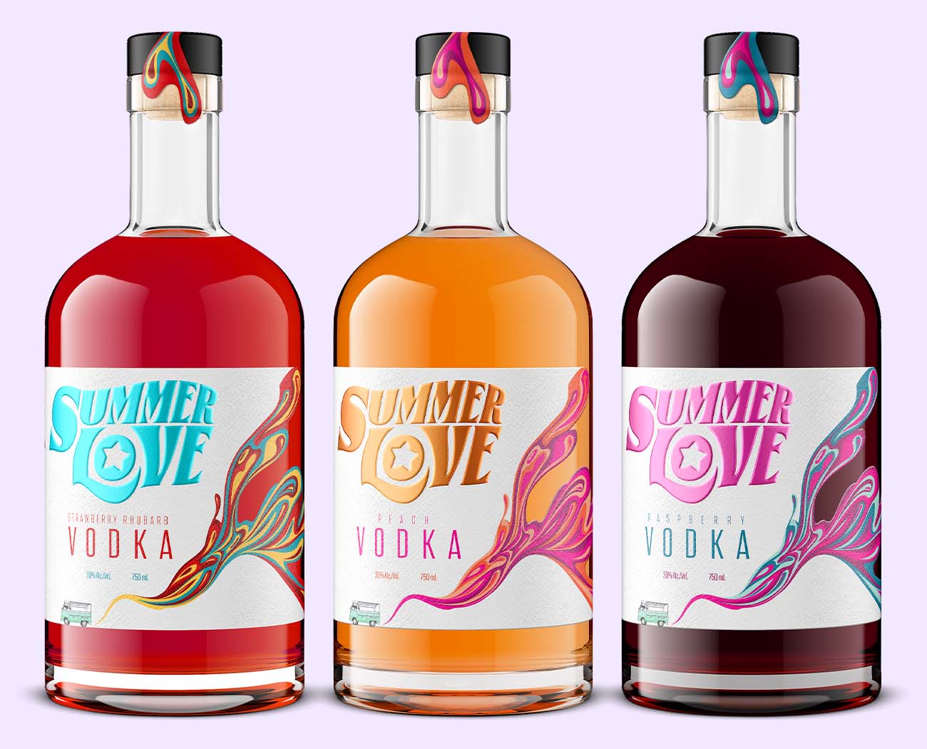
Unique flavors and ingredients give a vodka brand something concrete to differentiate on in a category built around neutrality. They also give the packaging a story to tell, which is why flavored expressions tend to carry the boldest label design in a portfolio.
Can vodka be part of a health-conscious lifestyle?
Many vodka brands now offer lower-alcohol, vegan, and gluten-free options aimed at health-conscious drinkers, and IWSR estimates no-alcohol drinks, including no-alcohol spirits, grew 9% globally in 2025. Clear labeling is what lets consumers match a product to their own dietary choices.
How do interactive elements on vodka packaging enhance the consumer experience?
QR codes, NFC chips, and augmented reality invite consumers to engage with the brand beyond the bottle. They can carry product detail, cocktail recipes, or a virtual distillery tour, which deepens the connection without crowding the label.
What is the best way to get product photography for a vodka brand?
The fastest route is a photorealistic render built from your label file and bottle specification, without a photoshoot and without shipping a single sample. Outshinery's 3D artists build spirits imagery this way, so your bottle shot is ready before your first production run and stays identical across every listing.
Because the image is rendered rather than photographed, a label update never means a reshoot, which keeps the time and expense of imagery predictable as your lineup grows.

The vodka packaging brief checklist
- Bottle mold: Exact glass mold and manufacturer, not just "tall and slender"; sculptural shapes need the spec sheet
- Closure: Cork, screw cap, or bartop, plus capsule material and any wax or shrink treatment
- Label files: The print-ready vector files that went to your printer, not a JPEG export or a phone photo
- Print finishes: Foil, embossing, silk screen, and frosted or tinted glass called out explicitly
- Liquid color: Reference photo or hex value for anything visible in clear glass, including flavored expressions
- Digital shelf specs: The resolution and format every retailer, marketplace, and DTC listing requires
One complete brief means the render matches the bottle on the first pass, not the third.