Tips for designing a beverage brand that survives the thumbnail
Most packaging is designed to be held. Online, your label is about 45 pixels wide.


Picture everyone who will ever come across your packaging. Some will hold it in their hands. Thousands will only ever see it as an image.
On a marketplace grid, a category page, or a shopping ad, they are looking at a small rectangle sitting next to a dozen others. They cannot turn it over to read the back. They cannot run a thumb over the paper.
Holding it and seeing it on a screen are two different jobs. Most design briefs only plan for the first.
How small is small
The numbers are less forgiving than they sound.
Google Merchant Center will stop approving product images under 500 x 500 pixels on January 31, 2027, with warnings running since July 2026. Google also asks that the product fill between 75% and 90% of the frame, and recommends 1500 x 1500 pixels or above for best performance across listing formats.
Now put a standard 750 ml Bordeaux bottle in that frame. It is about 75 mm wide and 300 mm tall, so at 90% fill it takes the full height and roughly a quarter of the width.
- In a 500 pixel product image, the bottle is about 450 pixels tall and 110 wide.
- In a 200 pixel grid thumbnail, it is about 180 tall and 45 wide.
- A front label one third of the bottle's height is around 60 pixels tall.
A 12 oz can is about 66 mm wide and 122 mm tall, so it uses more of the frame: roughly 240 pixels wide at 500, and 100 at 200. Better. Still small. The flavor name, the base spirit, and the ABV all have to live in that space.
These are back-of-envelope figures. Run them for your own containers and you can design for the result.
The format changes the math
A bottle is the hardest case, which is why the numbers above use one. Every other format fails differently.

- Cans get more width and lose it to the wrap. The front view shows roughly a third of the artwork, and the rest only exists if someone asks for a second angle. Anything that has to be read, the flavor, the ABV, the base spirit, belongs in that front-facing third.
- Multipack cartons are judged as a block of color before anything else. At 200 pixels the individual can design stops working and the carton panel takes over. A range that reads beautifully as twelve separate cans can collapse into one brown rectangle in a grid.
- Bag-in-box is the most forgiving format on a digital shelf, because it is mostly a flat panel facing the camera. It is also the one most often handled badly, since the panel has to sit square to the frame. A few degrees off and the whole package reads as a crooked cardboard box rather than a premium format.
- Shrink sleeves and screen-printed glass wrap like a can but curve harder. The front view is a narrower slice than the artwork suggests, and type set near the edges bends out of legibility before it reaches the silhouette.
Whatever a buyer has to read has to sit in the part of the package that faces forward.
Three tests to run before the file goes to print
Each of these is cheap to fix while the file is open, and expensive once the labels are printed.
The shrink test
Export the artwork at 200 pixels wide, then at 500. Look at each for three seconds. Write down what you saw.
Usually it is the brand name, one dominant color, and one shape. Everything else is texture.
That tells you where the hierarchy has to hold. The brand name and the variety or flavor must survive. The tasting notes, the appellation line, and the story paragraph will not, and that is fine. They belong in the product description.
One detail earns special attention: the vintage year. It is the one piece of information that makes an old image wrong, and designers most often set it small, in a corner. Jordan Tanaka, Tasting Room Manager at Shadow Ranch Vineyard, described the situation plainly:
Honestly, we were reusing old shots with the wrong vintage year because we didn't want to deal with it year to year.
A year that reads at 500 pixels makes that mistake easy to catch.
The white field test
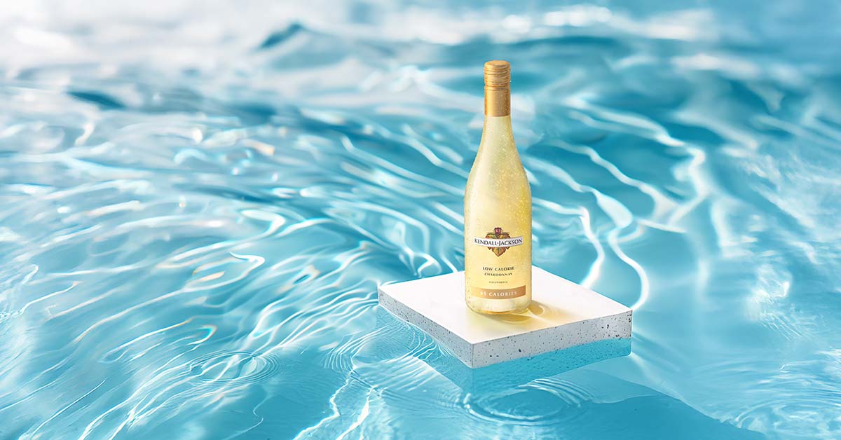
Most feeds and marketplaces show products on white or a neutral backdrop. In that setting, some details give up. A pale white wine in clear glass nearly disappears, so the label carries the whole image. A pale label on that same glass loses its edge. A white or silver can on a white field loses its silhouette. When the label and the backdrop blend, the shopper sees floating type.
Fix it in the file. Give the label a defined edge with a border, a darker ground, or a tint that separates it from the glass.
The grayscale test
Convert the artwork to grayscale. Foil, metallic stock, and pale gold accents all get judged here, because in a still image they are only as visible as their contrast with whatever sits next to them.
In your hand, gold foil on cream stock glints as the bottle moves. On a thumbnail it is a pale patch. The same foil on a deep green or black ink block holds its shape. If the foil carries the brand name, that difference decides whether the name exists online.
What each finish does once it becomes an image
Our article on 5 tips for designing eye-catching wine labels covers what these finishes are and why to choose them. This is what happens to them after the photo.
- Hot foil. Glints as the bottle moves in your hand. At 200 pixels it reads only through contrast with the ink or stock beside it. Set it against dark or saturated ink, not pale paper.
- Blind emboss. Obvious to the touch, nearly invisible straight on. Add ink or foil to the raised shape, or plan a label detail image.
- Deboss. A clear recess you can feel, a faint shadow at best in a still image. Same call as blind emboss.
- Spot or gloss varnish. Shows as sheen when tilted, almost gone in a thumbnail. Never let it carry information.
- High-build varnish. Raised and tactile in the hand. In an image it is shadow and highlight, and only under directional light. Treat it as texture, not as a mark.
- Metallized film or metallic stock. Mirrors the room in person, reads gray to silver depending on the backdrop. Check type contrast against the metallic tone.
- Lasercut window. The liquid shows through, so the wine's color becomes part of the label. Test with the real liquid color.
- Wax dip or colored capsule. Tactile and premium in the hand, a high-contrast color block at the top of the image. Treat the neck as part of the design.
- Screen-printed glass or shrink sleeve. The design wraps the whole container, but the front view shows one slice of the wrap. Keep the brand name inside the front-facing third.
A finish that fades in a photograph fades in an accurate render too. That is the point of an accurate render.
A trained 3D artist builds each finish. Brian Thornsberry of Innumero Wines put it this way: "You guys nailed the reflective characteristics of the foil/line artwork on label." The image shows the finish as it really behaves.
Choose finishes that still do their job when the buyer cannot touch them.
Front, back, and the views a buyer asks for
Many sales channels now expect both a front and a back view, as we covered in our piece on marketing prep for beverage brands.
Worth knowing how the regulator actually splits it, because it is not front versus back. TTB requires some items specifically on the brand label: the brand name, the class or type designation, and the appellation of origin where it applies. Everything else can sit on any label on the bottle. That list is the alcohol content, the net contents, the name and address of the bottler or importer, the sulfite declaration, a color ingredient disclosure where it applies, and the health warning statement, the block that reads GOVERNMENT WARNING.
In practice most producers push that second group to the back, which is why the back panel is crowded and the front is the part designers fight over. Export markets add their own layer: allergen statements, nutrition and ingredient panels, importer details, and in some markets a duty or deposit mark.
The thing to notice is that the front label is regulated too. The brand name and the class designation are not just the two things that survive a thumbnail. They are also two of the things TTB requires to be there.
At thumbnail size the back is unreadable. That is fine. Its job comes later, when the shopper zooms in on the product page. This is why the 1500 pixel recommendation matters more than the 500 pixel floor. The floor keeps the listing alive. The larger file lets someone actually read the back.
Set the required text at a size and contrast that survives a zoom, then ask for a close-up label detail image. It carries what a full-container image cannot: the emboss, the foil edge, the paper grain.
Judge the range, not the single container
Nobody sees your packaging alone. They see it in a grid, next to the rest of your range and next to competitors.

Line up your whole range at 200 pixels. Can a shopper tell the reserve from the entry wine, or the flagship from the seasonal? If the only difference is a finish that disappears, the range reads as one product.
Then pull two competitors from the search results for your category and set them beside yours at the same size. If yours vanishes, you found out for free.
Cans need a second check, because they have to work alone in a hand and as a repeated pattern of four, six, or twelve in a carton. Designs that look complete as a single can often turn into noise in a multipack. Our RTD branding guide goes deeper on that.

If the label is already printed
Everything above assumes a file that is still open. Plenty of brands are reading this holding a pallet of finished stock.
The finish is fixed at that point. The image is not.
- The angle. A foil block that disappears straight on can catch a highlight at a few degrees of rotation. The same is true of a deboss, which needs a shadow to exist at all.
- The light direction. Directional light is what makes a raised varnish or an emboss visible in a still image. In a render that is a setting, not a reshoot.
- The ground. A pale label on clear glass that loses its edge on pure white can hold it on a soft gradient or a tinted ground, wherever the channel allows something other than a white field.
- The label detail image. A close-up carries the emboss, the foil edge, and the paper grain that no full-container image at 500 pixels can hold.
- The range set. If your entry and reserve read as one product in a grid, rendering the range together with deliberate separation is where the difference gets built back in.
Each of those is a choice a person makes, not a preset. Alison Sloga, Creative Director at Mark Anthony Group, described what that looks like at the detail level:
Every little detail we specify is captured, bottle shapes, wine colour, light sources, reflections, punt style, fill line.
A printed label you cannot change still has an image you can.
What to hand over when the label is done
The image stage moves faster when the file is complete. Here is what to send.
- The packaged working files. Fonts, linked images, and layers intact, not a flattened export. A missing link is the usual reason one element of a finished image looks soft while everything around it is sharp.
- The dieline for any die-cut label. It is how the label gets mapped correctly onto the container.
- Finishes named on separate layers. Foil, emboss, varnish. Our printing checklist covers how to set them up.
- Closure and capsule choices. Color and material both show up in the image and change the overall look.
- The container specifics. Shape, glass color, and fill level.
Our label file requirements list the accepted formats.
None of this needs the liquid to exist yet. The label file is enough, which is why images can be ready before the wine is bottled.
Hear Laurie on Legends Behind the Craft
Outshinery founder Laurie Millotte joined host Drew Hendricks on the Legends Behind the Craft podcast to talk about designing a beverage brand. In the episode:
- Laurie shares how she got into graphic design and branding in the wine industry
- Behind the scenes at Outshinery, and how Laurie scaled her work
- How a website can create connections with potential clients
- The challenges suppliers faced in 2021, and how to work through them
- Laurie shares some of her favorite software, tools, and resources
Frequently asked questions
How big does my label appear in an online store?
On a standard grid, a 750 ml wine bottle is about 45 pixels wide in a 200 pixel thumbnail and about 110 pixels wide in a 500 pixel product image, assuming it fills 90% of the frame's height. The front label takes up roughly a third of that height, so the brand name and variety have to read at that size.
What size should product images be for Google Shopping?
At least 500 x 500 pixels from January 31, 2027, with the product filling 75% to 90% of the frame. Google recommends 1500 x 1500 pixels or above for best performance across listing formats.
Why does foil look flat in product images?
In your hand, foil glints as the light changes. In a still image, it only shows through contrast with the ink or stock beside it. Gold foil on cream stock reads as a pale patch. On dark ink, it holds.
Do embossing and debossing show up online?
Only under directional light. Straight on, they nearly vanish. Add ink or foil to the embossed shape, or ask for a close-up label detail image that shows the texture.
Does a can need different treatment than a bottle?
Yes, in two ways. A can fills more of the frame than a bottle, so type gets more room, but the design wraps and the front view shows only about a third of the artwork. And a can has to work twice: alone in a hand, and as a repeated pattern in a four, six, or twelve pack, where the carton panel is what a shopper actually sees first.
Do I need a separate image for the back label?
Most sales channels now expect one. TTB requires the brand name, class or type designation, and appellation on the brand label itself, and lets the alcohol content, net contents, bottler name and address, sulfite declaration, and health warning appear on any label, which is why most producers put them on the back. None of it is readable at thumbnail size. Its job starts when the shopper zooms in, which is why the 1500 pixel recommendation matters more than the 500 pixel floor.
My labels are already printed. Can anything still be fixed at the image stage?
The finish is fixed, but the image is not. The camera angle, the light direction, the background, a close-up label detail image, and how the range is rendered together are all still decisions. A foil block that disappears straight on can catch a highlight at a few degrees of rotation, and an emboss needs directional light to exist in a still image at all.
What is this Legends Behind the Craft episode about?
Host Drew Hendricks interviews Outshinery founder Laurie Millotte about designing a beverage brand. The conversation goes behind the scenes at Outshinery to show how the company uses technology to produce labels and high end marketing media for craft beverage brands.