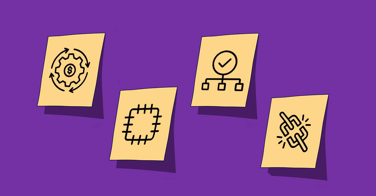
I am a wine label designer. Here are 10 things I always check before going to print.
Skipping it could lead to expensive re-runs!


With over 10 years of experience as a wine label designer, I know firsthand the consequences of rushing and neglecting a print checklist. The result? Thousands of unusable labels that end up being recycled. Needless to say, this isn't just disheartening but also a costly and time-consuming ordeal.
Drawing from my expertise as a packaging designer, I have developed a comprehensive checklist over the years. This checklist serves as a guarantee for my winery clients before they confidently proceed with the printing process.
I take great pleasure in sharing my insights below, in the hopes that they will assist you on your own design journey.
I always carefully select the label paper stock.
The choice of paper material for wine labels holds significance comparable to the design itself. It is crucial to opt for high-quality pressure-sensitive paper that strengthens the impact of your labels.
For a timeless appearance, estate paper often takes the lead, while heavy cotton or linen lend an artisanal touch when seeking a more handcrafted feel. When aiming for a metallic effect without straining the budget, silver metallized paper comes into play - perfect for catching the light without breaking the bank.
Personally, I have a preference for matte paper overall. If a paperstock tends to have an excessive glossiness that doesn't resonate with me, I wouldn't hesitate to apply a matte flood varnish. This not only adds a touch of sophistication but also maintains the original intent behind the label design.
I always make sure the label file color mode is set to CMYK.
Setting the color mode of a wine label file to CMYK before submitting it to the printers is crucial due to the way colors are processed and reproduced in print.
CMYK stands for Cyan, Magenta, Yellow, and Key (Black), the four ink colors used in most color printing. This color model is a subtractive one, meaning that colors are created by subtracting light from white. As more color is added, the result gets darker.
On the other hand, if you use a different color mode, like RGB (Red, Green, Blue), which is an additive color model used for digital screens, you may run into issues. RGB creates colors by adding light, resulting in a broader color gamut. However, this can lead to discrepancies when translating these colors to print.
Start with CMYK color mode to accurately replicate your chosen colors for wine label design in the final print. Working within the print's actual color range, CMYK helps avoid surprises when your design is printed.
This is particularly important for wine labels, where color can play a significant role in attracting customers and conveying the brand's personality. By working in CMYK, you'll be able to ensure that the hues chosen match the intended, desired color hues, helping to create a label that accurately reflects the wine inside the bottle.

I always try to refer to Pantone colors in my designs.
Color accuracy and consistency are paramount when designing wine labels. This is where the Pantone Matching System (PMS) comes into play. Pantone is a standardized color matching system that provides designers and printers with a universal language of color. Each Pantone color is assigned a unique number, allowing for accurate color translation across different media and printing techniques.
By referring to Pantone colors when designing wine labels, you can ensure the color on your design screen will match the color on the printed label, regardless of the printing method used. This is because Pantone colors are universally recognized and often used in the wine label industry. They provide a reliable standard that all parties involved in the design and printing process can refer to.
From a marketing perspective, using Pantone colors can give your product a competitive edge. With the extensive range of distinct and precise Pantone colors, you can choose hues that truly represent your brand and make your labels stand out on the shelves. Additionally, consistent color across all your labels contributes to a strong brand image, making your product easily recognizable to consumers.
I always use vector and/or high-resolution images.
As a wine label designer, using vector and high-resolution images is crucial for creating effective and professional designs. These elements ensure visually stunning labels that accurately represent the quality of the wine.
Vector images are created using mathematical formulas rather than pixels. This means they are infinitely scalable without losing any quality or detail. Whether your design is printed on a small label or a large poster, it will always remain crisp and sharp. This scalability provides tremendous flexibility in design and printing options. If you decide to use your label design in larger formats, such as banners or posters, a vector image will ensure that your design maintains its integrity and doesn't become pixelated when scaled up.

High-res images are vital for designing wine labels. They bring sharp details and vibrant colors that make your label stand out. I can't stress enough how important high-res images are. They directly affect how consumers perceive the product and brand. 'DPI' stands for 'dots per inch'. It measures image resolution, higher DPI means a sharper, clearer image, 300dpi is the standard printers go by when it comes to labels!
I always separate each embellishment printing technique onto distinct layers.
I can personally vouch for the significance of organizing each embellishment printing technique into distinct layers while designing in Adobe Illustrator. This approach is critical not only for design flexibility but also for optimizing print efficiency.
Each embellishment technique - such as foiling, embossing or debossing, spot UV, etc., requires a unique process during printing. By separating these into distinct layers, you provide clear instructions to your printer about where and how each technique should be applied. This reduces the risk of errors and misunderstandings, leading to a smoother and more efficient printing process.
From a design perspective, having each printing technique on a separate layer gives you greater control over your label. You can easily modify, add, or remove individual elements without affecting the rest of your design. This flexibility can be a significant time-saver, especially when revisions are needed.
For example, if you decide to change the area of the label with a foil finish, you can simply adjust that specific layer without disrupting the underlying artwork or other embellishments.

I always get the winery to check the barcode, QR code and alcohol content before going to print.
Double-checking critical information before going to print is not just good practice, it's absolutely essential. Let's consider three key elements:
Barcode: Barcodes are vital for inventory management and sales transactions, containing product information for quick and accurate scanning at the point of sale. Ensuring barcode accuracy before printing is crucial. This involves verifying not only the numerical values but also the print size to ensure smooth scanning at the retail space.
QR Code: QR codes on wine labels often contain additional information about the wine, such as tasting notes, vineyard details, or pairing suggestions. Some even link to a brand's website or promotional content. Ensuring the QR code is correct is important because an error can lead to confusion, frustration, or a missed marketing opportunity if customers are directed to the wrong information.
Alcohol content: The alcohol content displayed on the wine label is legally required in many regions. If the label shows the wrong alcohol content, it can mislead consumers and potentially violate legal regulations, leading to fines or other penalties.
Any mistakes can lead to costly reprints, operational issues, legal problems, and even damage to your brand's reputation. By taking the time to double-check all information on your wine labels before they go to print, you ensure accuracy, compliance, and a better experience for both your business and your customers.
I always package my Adobe Illustrator design files.
One of the most important steps in finalizing my work is to properly package my Adobe Illustrator files. Packaging files ensures that all necessary components of my design - including fonts, linked images, and other files - are included in one neat bundle. This step is crucial for several reasons.
To preserve design integrity: Packaged files ensures all elements of the design are kept intact. If a particular font or linked image is missing, the design will not appear as intended on different computers or when sent to the printer.
To maintain workflow efficiency: By packaging all necessary files together, the handover process to the winery and/or printer is simplified. This reduces the risk of missing assets, saves time, and prevents any back-and-forth communication about missing elements.
I always export the final label designs as PDFs with bleeds.
One of the key aspects I consider when preparing my design for print is the inclusion of printing bleeds and exporting your final design as a PDF.
"Bleeds" is the extra margin around the design that extends beyond the actual dimensions of the label. This extra space is crucial because it allows for slight variations that can occur during the printing process, such as paper shifts or minor misalignments.
Without bleeds, any slight movement in the paper could result in an edge of your label not being printed, leaving a white or unprinted line. This can disrupt the overall look of your label, making it appear unprofessional.
For example, if your label design includes a background color or image that extends to the edge of the label, not including a bleed could result in a small strip along the edge of the label where the background color or image isn't printed. This can lead to undesired trimming and a label that looks poorly made.
Exporting your design as a PDF with bleeds ensures that the printer has all the necessary information to accurately print your design. The PDF format is universally accepted, maintaining the integrity of your design elements, including fonts, colors, and images, regardless of the software used by the printer.

I always ensure that I review physical printed label samples before proceeding.
I strongly advocate for the review and approval of actual printed label samples before proceeding with a full print run. This critical step serves multiple purposes:
Quality assurance: A physical sample allows you to inspect the quality of the print. You can check the resolution, color accuracy, and overall finish of the label. Digital proofs can sometimes be misleading due to variations in screen calibrations.
Error detection: It's easier to spot errors or inconsistencies on a physical print than on a digital screen. This could include typos, layout issues, or misalignment of design elements.
Color matching: As discussed earlier, it's essential for the colors of the printed label to accurately represent the brand. By reviewing a physical sample, the winery can ensure that the colors are consistent with their brand identity.
Material testing: A physical sample allows you to feel the texture of the label material and see how it interacts with the wine bottle. This is especially important if you're using special finishes or materials like foil, embossing, or premium paper.
Context evaluation: Seeing the label on an actual bottle in various lighting conditions gives a real representation of how the final product will look. This can influence final tweaks to the design or materials used.
The review and approval of physical samples should involve both the designer and the winery. The designer ensures the label meets the design specifications, while the winery provides the brand perspective. This collaborative process helps avoid costly mistakes and ensures that the final printed labels meet everyone's expectations, contributing to a successful product launch.
I always submit the final packaging design to Outshinery to get bottle shots asap.
Once you've perfected your label design, it's time to showcase it in the best light possible. This is where submitting your new packaging to a professional service like Outshinery comes in.
Outshinery specializes in creating high-quality digital bottle shots, which are essential for marketing and advertising your product. Here's why getting this product content done as soon as your design is finalized is beneficial:
- Quality: Outshinery uses advanced technology to create lifelike, high-resolution images that highlight every detail of your design. These visuals can be far superior to traditional photography, especially when it comes to capturing the nuances of labels, foiling, or embossing.
- Time and cost saving: Traditional photography involves arranging a photoshoot, hiring a photographer, and possibly even shipping bottles, all of which can be time-consuming and costly. With Outshinery, you simply submit your design and receive your bottle shots digitally, saving both time and money.
- Marketing and advertising: High-quality images are crucial for marketing and advertising efforts. They can be used across various platforms, from your website and online store to social media, email campaigns, and print advertisements. Having these images ready as early as possible allows you to start promoting your new product right away.
- Consistency: Outshinery ensures consistency across all your bottle shots, regardless of when they're produced. This uniformity strengthens your brand image and makes your product lineup look more cohesive.

by submitting your finalized packaging wine design to Outshinery, you not only save time and money but also ensure you have high-quality, consistent images ready for your marketing and advertising needs. This step enables you to kickstart your promotional efforts as soon as your design is ready, giving you a head start on bringing your product to market.
Printing checklist for wineries, in conclusion
So, we have examined the top 10 essential considerations when it comes to printing your labels. With my extensive experience as a wine label designer and the expertise of the Outshinery team, I assure you that following these tips will prevent costly mistakes and minimize back-and-forth communications.
Did you know that Outshinery was founded by a passionate wine label designer, and many members of our team share a background in this field? We are delighted to share our expertise in wine label design for the alcoholic beverage industry with you, hoping it proves valuable.
Crafting an exceptional wine label demands meticulous attention to detail, a discerning design sensibility, and a comprehensive grasp of the printing process. By keeping these elements top of mind, one can achieve successful printing even for the most intricately designed wine labels.
Key takeaways
- Meticulously choose the paper stock for your wine labels. Ensure that it aligns perfectly with your desired quality and aesthetic.
- Make sure that the color mode of the label file provided by your designer is always set to CMYK.
- Using Pantone colors when designing wine labels is a best practice for color accuracy and consistency.
- Ensure crisp and precise label printing by using vector and/or high-resolution images for your labels.
- Make sure your designer separates each embellishment printing technique into distinct layers. This not only streamlines the printing process but also allows for flexible design modifications.
- Double-check all the info on your wine labels before they go to print to ensure accuracy and compliance (don’t forget the barcode and QR code if applicable!)
- Obtain packaged Adobe Illustrator files from your designer to ensure you have all the essential components for your label design, including fonts and linked images.
- Export label design as a PDF with bleeds to ensure accurate printing in a universally accepted format.
- Review and approve physical printed label samples for a seamless and successful product launch.