5 tips for designing eye-catching wine labels
Increase sales and stand out on shelves with captivating branding and packaging.


A 2022 study found that wine labels dominate consumer buying motivation, with 60% of consumers saying that the label is the most important factor when choosing a wine!
The way you package your product — from label design to cap choice, and from bottle shapes to print finishes — speaks volumes about your brand. The first impression of potential customers can either pique their interest or turn them away. That's why it is crucial to ensure your packaging is both attention-grabbing and easy to remember.
Short summary
- Choose the right typography and color scheme for your wine brand
- Experiment with unique shapes and illustrations for your bottle to stand out
- Make your wine labels “read” from far away (or when viewed on small screens!)
- Enhance the appeal of your wine labels using unique printing techniques
- Think beyond paper: Consider alternative materials or printing methods
Need design inspiration for your wine label? From creative illustrations paired with meaningful typography to bold colors and unexpected materials, here’s Outshinery's advice on designing wine bottles that are sure to catch shoppers’ attention and keep them coming back.
#1. Choose the right typography and color scheme for your wine brand
How should brands select the right fonts for their product labels?

No comic sans here! When it comes to designing any label, choosing the right primary and secondary fonts can make all the difference.
When selecting a font for your wine label, it is important to consider the overall design aesthetic you want to achieve. For example, if you want to create a vintage look, then you may opt for fonts such as Tiempos, Lyon, JAF Lapture, Pona, Bembo, or Warnock. If you’re looking for something more modern and contemporary, then fonts like Mrs Eaves or Preto Semi might be better suited.
It’s also important to remember that less is more when it comes to font selection — try not to go overboard with text and opt for two complementary fonts instead.
If you are looking for some inspiration, check out the “Hot new fonts” section on MyFonts. You may be surprised by the sheer amount of possibilities, with new options added daily!
What should wineries consider when choosing label colors?

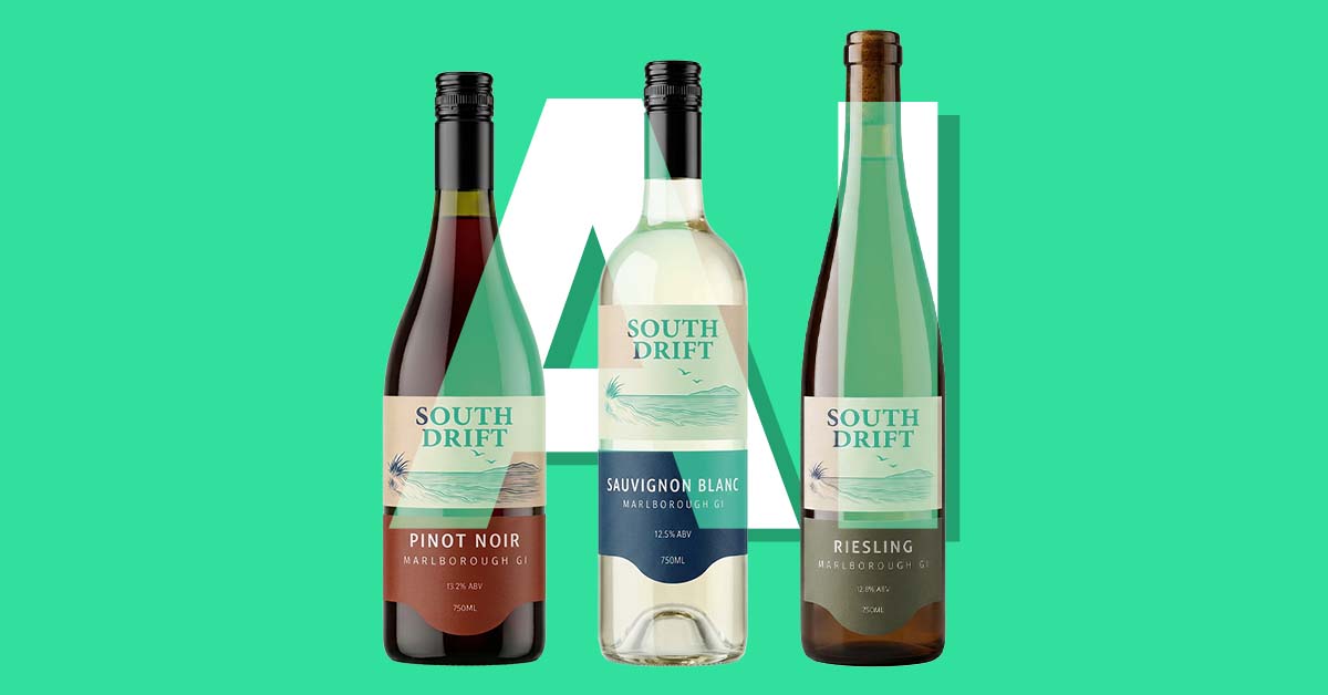
When it comes to label colors, wineries have a few important factors to consider. Certain hues are connected with specific varietals — take deep red for Cabernet Sauvignon, for example, or straw yellow for Chardonnay.
However, while it's essential to adhere to industry norms, the labeling phase also presents an opportunity to differentiate your product with a unique color palette that'll stand out on shelves.
While punchy, vibrant hues may boost bottle visibility, too many might border on overwhelming or distracting for consumers. Instead, there should be a balance - eye-catching tones that indicate the flavor of the wine without steering into harsh or overbearing territory.

Choose colors wisely to put your product head and shoulders above the rest!
#2. Experiment with unique label shapes and illustrations for your bottle to stand out
Why should wineries consider not using a conventional rectangle label shape?

Wineries can make their wine bottles more appealing by avoiding the use of conventional rectangle-shaped labels. Opting for custom die-cut shapes not only makes them more visually striking in today’s dog-eat-dog market but also allows them to accentuate their brand identity and create a lasting impression on consumers. These artful details lend your branding an air of originality.
So why settle for being lost in the crowd? Incorporate exciting shapes into your label designs and let them seize the attention of potential customers, even if you're a traditional winery at heart. Modern consumers expect designs to be catchy and memorable, and this small change can make a big impact!
How illustrations can enhance wine brands' packaging and labels?

To bring uniqueness and spark to wine brands, illustrations should be considered as an addition to wine packaging and labels. These eye-catching designs elevate product identity and convey intriguing stories that entice customers. Moreover, they offer various stylistic options, ranging from minimalist to whimsical, affording brands the opportunity to reflect their values while creating a visually appealing aesthetic.
Illustrations also heighten the sense of luxury in the packaging, never compromising the wine's intended status of elite quality and exclusivity. The beauty of illustrations extends beyond simple aesthetics to emotional connection as well. Wine lovers are obsessed with the way illustrations stir up emotions and create a sense of familiarity with the brand.
Illustrations offer a unique way to stand out in the competitive wine industry and create a lasting bond with customers. Wine brands should consider incorporating illustrations into their packaging and labels for an enticing and unforgettable experience.
#3. Make your wine labels “read” from far away (or when viewed on small screens!)
Physical presence on shelves in stores

According to Nielsen research, product labels have immense power to influence consumer behavior, with up to 62% of shoppers basing buying decisions on them. In a competitive retail environment, eye-catching labels are critical insurance that your product stands out from the rest.
To make a lasting impact, labels must be identifiable and readable from a distance. As such, when creating custom labels, designers should prioritize readability by opting for simplicity.
Imagine two billboards; one with intricate graphics and tiny fonts, the other with large fonts and bold colors. Which one would catch your eye? The simplified one, right? By prioritizing simplicity, you can create an appealing, memorable label that grabs attention.
Consider ecommerce and online retailer standards

A great product hero image can make or break a sale, whether you're selling directly to consumers, or through third-party retailers, distributors, and supermarkets.
When portraying a wine bottle, consider the use of computer-modeled images (i.e. Outshinery!), to render an accurate and perfect representation of the original. Pay attention to the smallest details, such as reflections on glass surfaces and their interaction with the environment.
Also, ensure that all labels are legible to capture the essence of the brand and communicate its message effectively. Indeed, an effective product hero image is crucial, as Drizly's studies have shown a 3X increase in click-through rate (CTR) for online wine sales.
#4. Enhance the appeal of your wine labels using unique printing techniques.
What are embossing and debossing techniques on paper labels?

Embossing and debossing are two popular techniques used on paper wine labels to add texture and dimension to the design. Embossing elevates a pattern or image from the surface while debossing creates an indentation on the surface. Both impart multi-dimensional effects and elevate printed surfaces with sophistication and panache.
Want to take it up a notch? Consider blind embossing where the design is pressed into paper without ink or foil for a subtle yet stunning visual. Alternatively, sculpted embossing, achieved through a thicker sculpted die, provides a more pronounced and three-dimensional effect, especially with metallic hot stamping.
What is precious metallic foil stamping on wine labels?

Precious metallic foil stamping is a printing technique used to add a luxurious touch to wine labels. It is also known as hot foil stamping, gold blocking, or simply foil printing.
This process involves using heat and pressure to transfer metallic foil onto the label, creating an eye-catching design that stands out from the crowd. The result is a unique and elegant look that adds value to any bottle of wine.
What are the differences between highbuild, gloss, flood, and matte varnish for wine labels?
The varnish a winery chooses can make or break the look of your label.
Highbuild varnish is a thick coating that adds texture and depth to your design, while gloss varnish gives a glossy finish for maximum shine. Flood varnish is a thin layer of coating that covers the entire label, while matte varnish provides an elegant, subtle look with no shine.
All four types of varnishes have their own unique advantages and disadvantages, so it's important to consider all options before making your final decision.
What about combining/layering multiple printing techniques at once?

Attention to detail is key in creating a statement that sets your labels apart. To achieve this, combine multiple printing finishes for a truly dramatic effect. For instance, try combining a sculpted emboss with metallic copper hotstamp and overprint ink — a winning combination that adds texture, dimension, elegance, and sophistication.
With these three elements, create a stunning label that will take your wine to the next level. Sufficient planning and attention to detail will help you design a label that attracts and retains customer attention beyond the final sip of wine.
Wondering how to make your product stand out from the rest? Consider opting for special printing techniques like embossing and foil stamping. These methods add heightened elegance and sophistication to your product packaging, ultimately setting you apart from your competition and gaining attention for your brand.
How to approach paper lasercut for my wine labels?

Laser-cutting on paper is an excellent way for wineries to elevate their designs and create something truly exceptional. Unlike traditional printing methods, lasercutting enables intricate details and shapes that are bound to impress your customers.
With endless possibilities, paper lasercut labels let you showcase intricate patterns and "windows" on your label. By incorporating visual elements into your labels, you're making them more appealing and adding value for your customers. Great packaging immediately elicits a reaction, from shock to a smile. Your design can bring customers emotionally closer to your brand.
#5. Think beyond paper: Consider alternative materials or printing methods
Opt for a different type of pressure sensitive solution than paper.

Pressure-sensitive paper stock is a prevalent adhesive material used for wine labels. It comprises paper, plastic film, and other substrates coated with adhesive on one side to adhere to glass surfaces under pressure.
The art of a wine label design goes beyond paper. That’s why many more materials are available with pressure sensitive solutions. Winemakers can use an array of materials, from wood to metallic silver, to elevate their presentation and make their brands stand out from the rest. With enticing labels that catch the eye, it's easier to attract consumers and persuade them to pick your product.

Consider screen printing your wine labels for a 360 design
Wine labels are an essential component of a winery's branding and marketing strategy. Many wineries opt for screen printed labels because they offer a 360-degree design that wraps around the bottle, giving them more creative freedom. These labels, also known as Applied Ceramic Labels (ACL), have a longer lifespan and are more durable against water damage and fading. (This is perfect for chillable bottles that will be put in an ice bucket.)
However, don't forget to consider the overall production costs and the additional shipping to and from the silkscreen factory, leading to longer turnaround times. While screen printed labels may be visually appealing, the use of this label printing technique requires careful evaluation. Nonetheless, their unique ability to showcase eye-catching designs makes it a worthwhile investment for those looking to make their brand stand out in the competitive wine industry.
Explore glass etching for a tactile and premium experience

Are you looking for ways to distinguish your wine labels and offer customers an exceptional experience? Glass etching is an excellent method to achieve this.
Delicate designs created with a laser or sandblasting technique can add an intriguing tactile element to your wine label, capture customer attention, and distinguish your product in the market.
Furthermore, glass etching allows you to create top-of-the-line labels that exude luxury and elegance. By adding detailed designs, you can transform your bottles into a premium product that impresses your customers, adding a touch of glamour to their wine experience.
Think of metal plates for an attractive and elegant wine label

Metal plates are an ideal choice for high-end wineries because they offer a timeless look that stands out from the crowd. They are also incredibly durable, so you can be sure that your labels will last for years to come. Your customers might even choose to retain these bottles as keepsakes or repurpose them for water, flowers, or candles.
Metal plates can be customized with intricate designs, logos, and text, allowing you to create a truly unique label for your wine bottles. The metal plate material is also resistant to water and other liquids, making it perfect for use on bottles of wine or other alcoholic beverages.
The metal plate labels are also easy to attach to the bottle; simply glue them onto the bottle and they'll stay put. This makes them much more convenient than traditional paper labels which often require additional adhesive or tape in order to stay in place.
Summary
Wine labels truly play a critical role in any successful wine brand!
Branding and packaging have incredible potential for return on investment, as they are often the first thing that customers see when selecting a bottle of wine. A great label design will help to differentiate your product from the competition and make it stand out on the shelf.
Wine labels also provide an opportunity to tell your brand story and create an emotional connection with customers. By using unique fonts, colors, and imagery, you can create a memorable label that will leave a lasting impression. Additionally, since wineries use their labels every day, it’s important to have a design that you are proud to display!
Takeaways for creating captivating wine labels:
Design matters. A unique and creative wine label will make your product stand out from the rest.
Consider the consumer. Consider your target audience and their purchasing power. Then, contemplate what will happen to them on a bottle of wine.
Don't be afraid to break the mold. Be daring and do something different to really catch the eye of potential customers.