Why inconsistent bottle images quietly weaken your brand
Mismatched lighting, backgrounds, and uneven bottle shots quietly erode buyer trust and perceived quality.

Your buyer never holds your bottle. They meet it as an image, on a phone, next to nine competitors.
That image is doing more work than you think. When it is inconsistent, it works against you quietly.
The shelf is a screen now
For most beverage brands, the first encounter with a product is digital. A DTC listing, a distributor portal, a marketplace tile, an Instagram grid.
The digital shelf is the only shelf most of your buyers will ever see. What sits there represents your brand whether you curated it or not.
A buyer decides before they read a word
Perception forms fast. MIT researchers found the brain can identify an image seen for as little as 13 milliseconds.
Your tasting notes, your awards, your story, all of it arrives after that first visual judgment. By then the buyer has already decided whether your product looks like it belongs.
On a product page, images are the first thing people reach for. Baymard Institute found that inspecting the images is the first action for 56% of shoppers landing on a product page.
What inconsistency actually signals
Inconsistency rarely reads as "these photos were taken at different times." It reads as a brand that is not quite in control.
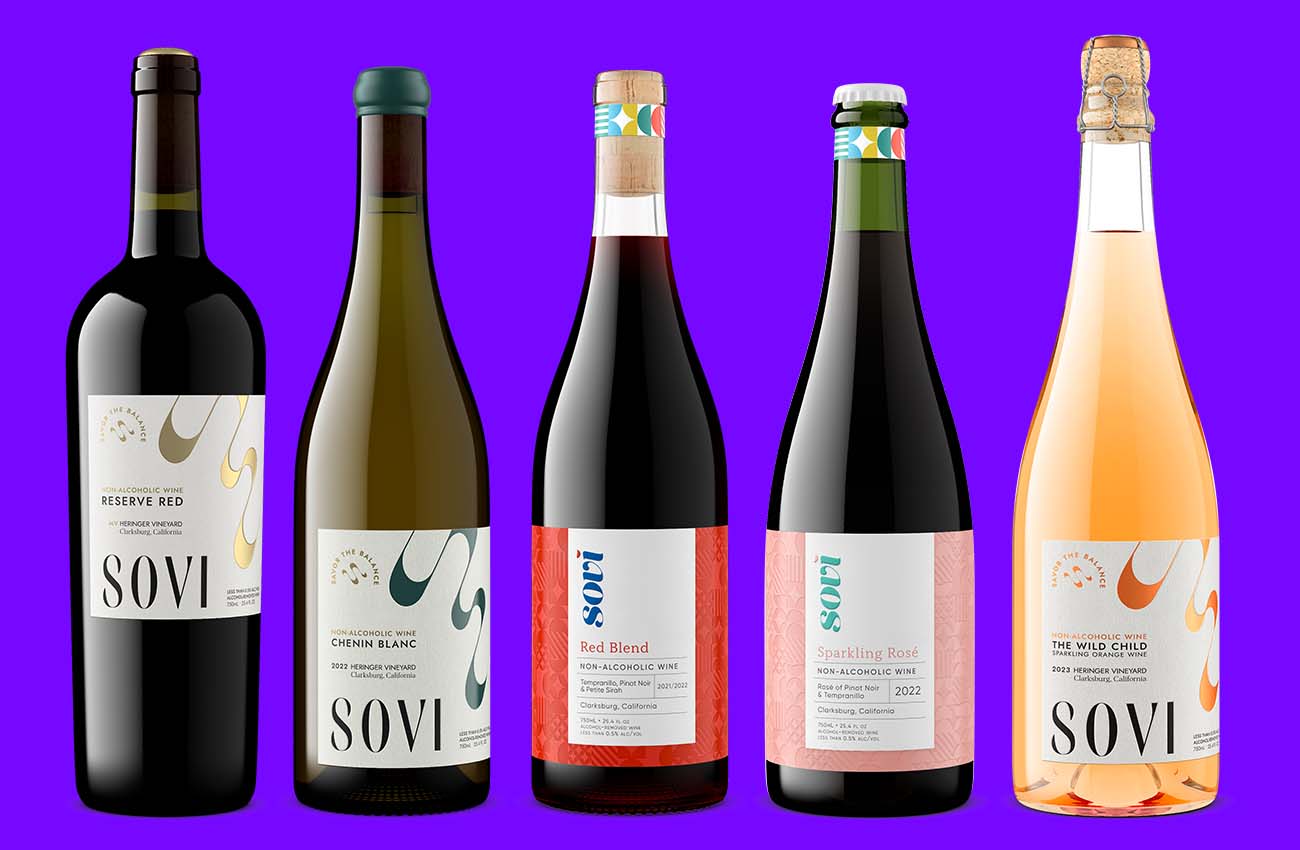
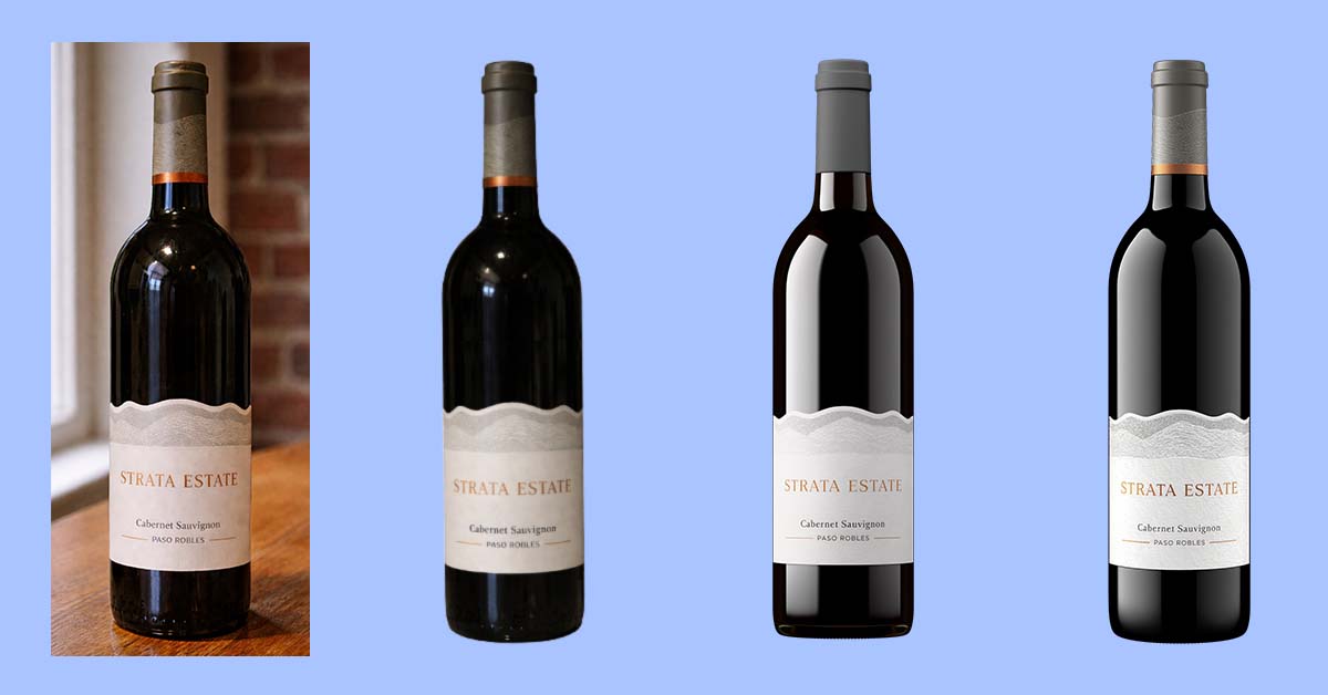
Mismatched lighting across your SKUs. A white background on one shot, a grey cast on the next. One bottle centered, another floating slightly off.
Individually minor. Together, they tell a buyer that nobody is minding the details. Buyers rarely name that feeling. They just trust the brand a little less.
Where the cracks show up
The gaps appear in predictable places.
Across SKUs, when a new release is shot by a different hand than the last. Across vintages, when this year's photo does not match last year's on the same wine.
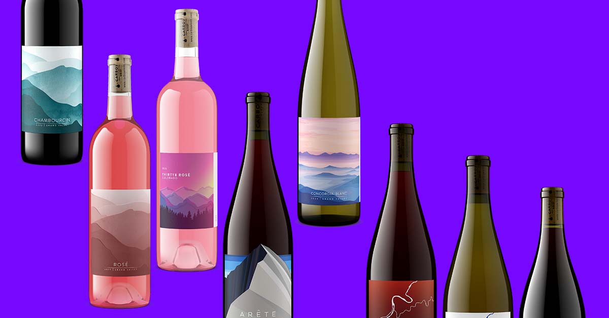
Across channels, when the marketplace image, the wholesale sell sheet, and the website hero were all sourced separately.
One tasting room manager told us they had been reusing old shots with the wrong vintage year, because updating them every season was not worth the hassle. That is the quiet cost of imagery that is hard to keep current.
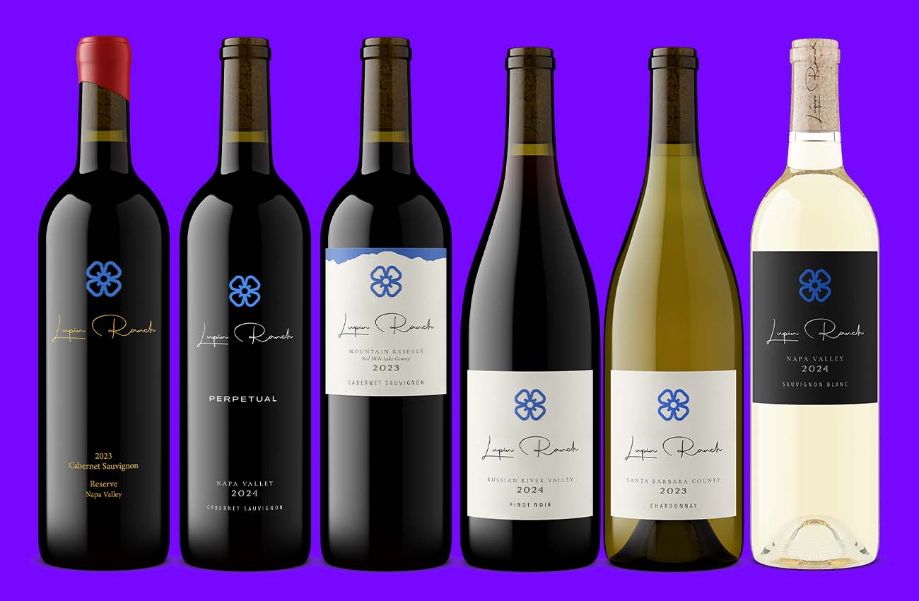
The brands that avoid it treat consistency as non-negotiable. As Courtney Harris put it: "Exactly the same EVERY. SINGLE. TIME. No variation vintage to vintage, no angle variation."
Perceived quality is fragile
Premium positioning is built on coherence. The moment your visuals stop agreeing with each other, the premium signal starts to leak.
A buyer comparing two wines they cannot taste will use the only evidence in front of them. The brand whose images look considered reads as the higher-quality product, often regardless of what is in the bottle.
This is not a soft value. Lucidpress's State of Brand Consistency Report linked consistent branding to as much as 33% higher revenue across the 200-plus companies it surveyed.
You cannot retouch your way to consistency after the fact. It has to be built into how the images are made.

Consistency is a system, not a lucky streak
That means one set of lighting rules, one background standard, one way every bottle sits in frame, applied every time, no matter who orders or when.
This is exactly where traditional photography struggles. A new shoot means a new photographer, a new setup, and a slightly different result.
How Outshinery keeps your images consistent
Outshinery builds your product as a 3D model, then renders every image from the same controlled setup. The lighting, the angle, and the background do not drift between orders.
Outshinery specializes in beverage packaging, so the render knows a punt from a push-up and a screwcap from a cork. A generalist 3D service does not.
Studio is the human-led option. Trained 3D artists build and render your packaging, getting the fill line, the deboss, the foil, and the closure right. For complex containers, specialty finishes, and premium presentation, an artist works on every output.
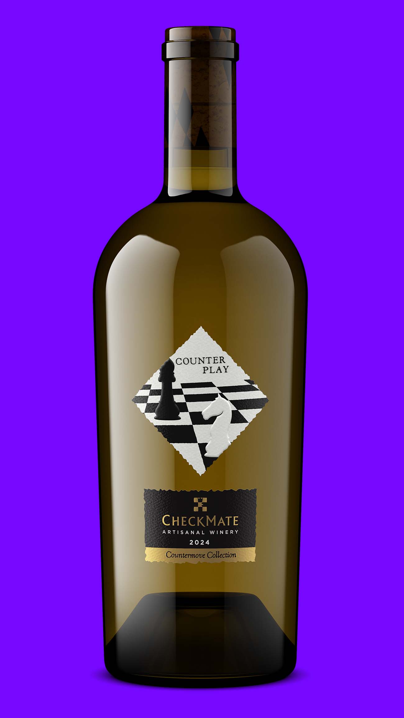
Lite is the self-serve option for standard bottles. Upload your label, pick your bottle and closure, and get a photorealistic bottle shot in about an hour, built on the same Studio-grade foundations.

Because both start from a consistent 3D model, your tenth image matches your first. Update a vintage or a label, and the new render still belongs to the same family.
Your images are either building trust or quietly spending it. Align your visuals before trust erodes.
Frequently asked questions
Does product image quality really affect buyer trust?
Yes. Product images are the first thing most online shoppers evaluate, and Baymard Institute found inspecting images is the first action for 56% of users on a product page. Inconsistent or low-quality images signal a brand that is less in control, which lowers perceived quality before a buyer reads a word.
What does inconsistent product imagery look like?
It shows up as mismatched lighting, different backgrounds, varied angles, and uneven framing across your SKUs, vintages, and sales channels. Each difference is small on its own. Together they make a product line look assembled from unrelated parts.
How does image consistency affect perceived quality?
When buyers cannot taste a product, they judge quality from the visual evidence in front of them. A coherent set of images reads as a more premium, more trustworthy brand. Lucidpress's State of Brand Consistency Report linked consistent branding to as much as 33% higher revenue.
Who makes consistent photorealistic wine packaging visuals?
Outshinery produces photorealistic 3D visuals for wine, spirits, beer, and RTD packaging without a photoshoot. Every image is rendered from a 3D model of your product, so the visuals stay consistent across SKUs, vintages, and channels. Studio is human-led for complex or premium packaging; Lite delivers standard bottle shots in about an hour.
Can I get consistent images before my product is bottled?
Yes. Because the images are rendered from a 3D model, not photographed, you can get them before the physical bottle exists. That lets your visuals be ready for a launch date, a buyer's spec, or a listing deadline without waiting on production.