How to photograph a glass bottle without reflections
Why glass reflections happen, how pros control them, and why beverage brands are moving past the camera entirely.

Glass is the second most reflective surface most people own, right after a mirror. Point a camera at a wine bottle and every light source within ten feet shows up somewhere on the curve.
The lamp behind you. The window you forgot was open. The gleam on the floor that you cannot see with your eyes, but that the sensor catches in full detail.
This is why bottle photography looks straightforward in a tutorial and goes sideways the moment you try it.
The good news is that reflections follow predictable rules. Once you understand how light behaves on a curved glass surface, you can control where it lands. Most of the time.
The rest is patience, retouching, and a few practical tricks that make the difference between a usable image and one you would not show your distributor.
Here is the full guide, written for beverage brands who need their bottles to look right on a shelf, a website, a Commerce7 listing, or a distributor catalog. We walk through the craft of glass photography first. Then we look at why a growing number of wineries, breweries, and spirits brands have moved away from the camera entirely.
Why glass is so hard to photograph
Diffuse vs specular reflection
Reflections come in two flavors. Diffuse reflection is what makes a white wall look white from any angle: light hits the surface and scatters in every direction.
Specular reflection is the opposite. Light hits the surface and bounces off in a single, predictable direction, like a mirror.
Glass is mostly specular. The same is true for foil, varnish on a label, and the surface of the wine itself.
Why curved glass multiplies the problem
That is the problem in one sentence. Every light source in the room becomes a reflection on the bottle, each with its own position, shape, and brightness.
Because the bottle is curved, those reflections stretch, warp, and multiply across the surface.
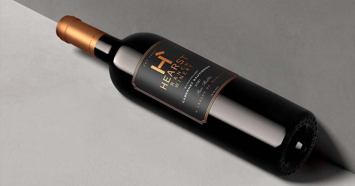
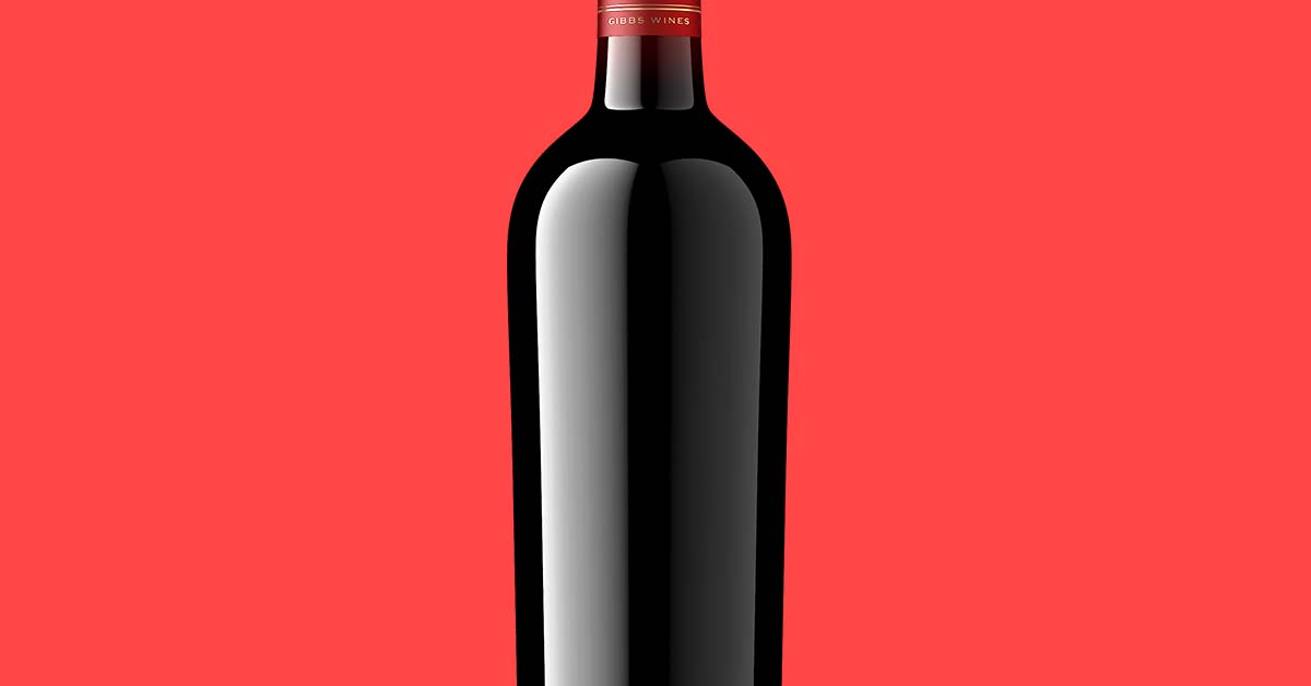
The deep black you see along the sides of a dark wine bottle in a finished shot is not really black. It is the absence of reflection, created by placing black sheets on either side of the bottle to subtract the light coming from those directions. The result is a clean, dark border along the edge of the glass.
Pro photographers spend most of their time controlling unwanted reflections on the bottle rather than what is actually on it.
The four-light setup for glass
Most professional glass photography uses some version of a four-light setup. The exact gear changes. The logic does not.
Key light
The key sits at roughly forty-five degrees off-axis, soft and broad, providing the main illumination on the label. A large softbox or a diffused strip light works.
The bigger the light source relative to the bottle, the softer the highlights and the more flattering the curve.
Fill light
The fill sits opposite the key, dialed down by one to two stops. Its job is to lift the shadow side without flattening the shape.
Many pros use a white reflector instead of a second strobe for this, which is cheaper and more controllable.
Rim light
The rim comes from behind the bottle, slightly to one side, creating a bright line along the edge of the glass that separates the bottle from a dark background.
For wine bottles especially, the rim light is what gives the shoulder and the punt their dimensional definition.
Negative fill, the secret weapon
A black flag, a card, or a piece of foam core placed close to the bottle on the side opposite your key.
It absorbs stray light and creates the deep, clean blacks on the glass that read as professional. Without negative fill, glass bottles look milky and washed out.
Get the negative fill right and half the battle is over.

Polarizing filters and when they help
What polarizers do well
Polarizing filters cut specular reflections by blocking light waves traveling in certain orientations. On a circular polarizer, you rotate the front element until the reflection on your subject drops out.
This works well on water, on car paint, and on flat glass. On a bottle, polarizers help with specific problems and do nothing for others.
They are useful for reducing the bright highlight on the curved shoulder of a clear glass bottle, controlling reflections on glossy labels, and cutting glare on a varnished closure.
Where polarizers fall short
They are less useful for deep liquid (red wine, dark spirits) where the reflection is on the glass surface but the absorption happens inside the bottle.
They are also limited on foil capsules, where the metallic surface produces complex multi-axis reflections that a single polarizer cannot kill.
Cross-polarization for tough labels
For tricky labels, photographers sometimes use cross-polarization. A polarizing gel goes on the light source, and another polarizer goes on the lens, set at ninety degrees.
This cancels reflections almost entirely and gives you a flat, matte rendering of the label. It also kills the natural shine of the glass, so it works best when you composite the label separately and bring back the glass reflections in post.
Choosing a background
The default for ecommerce is a pure white sweep, a long sheet of paper curved up behind the bottle so the floor and the wall blend into a single continuous surface. Amazon, Uber Eats, and most marketplaces ask for it.
For brand or editorial work, a soft gradient (darker at the top, lighter at the bottom, or the reverse) tends to read richer and is more forgiving with reflections because the eye expects tonal variation.
Pure white is the hardest to get right. Any unevenness in lighting reads as a stain on the background, so plan on a cleanup pass in retouching.
Handling label glare
The label is the part of the bottle the client cares about most. It is also the surface most likely to flare. Three things control label glare.
Angle. Move the key light farther off-axis until the bright highlight slides off the label. The angle of incidence equals the angle of reflection, so if you can see the light source reflected in the label, the camera will too.
Diffusion. A bigger, softer light source produces a softer, broader reflection that is easier to position outside the label area. A bare strobe gives you a hard, hot spot. A four-foot softbox gives you a wide, gentle highlight you can place where you want it.
Cross-polarization. Used as a last resort for labels with heavy foil, varnish, or texture that no angle or diffusion fully tames. It kills the natural shine of the glass along with the glare, so most pros use it as a clean starting point and rebuild the highlights in post.
Pick the lightest-touch option that works. Reach for cross-polarization only when angle and diffusion are not enough.
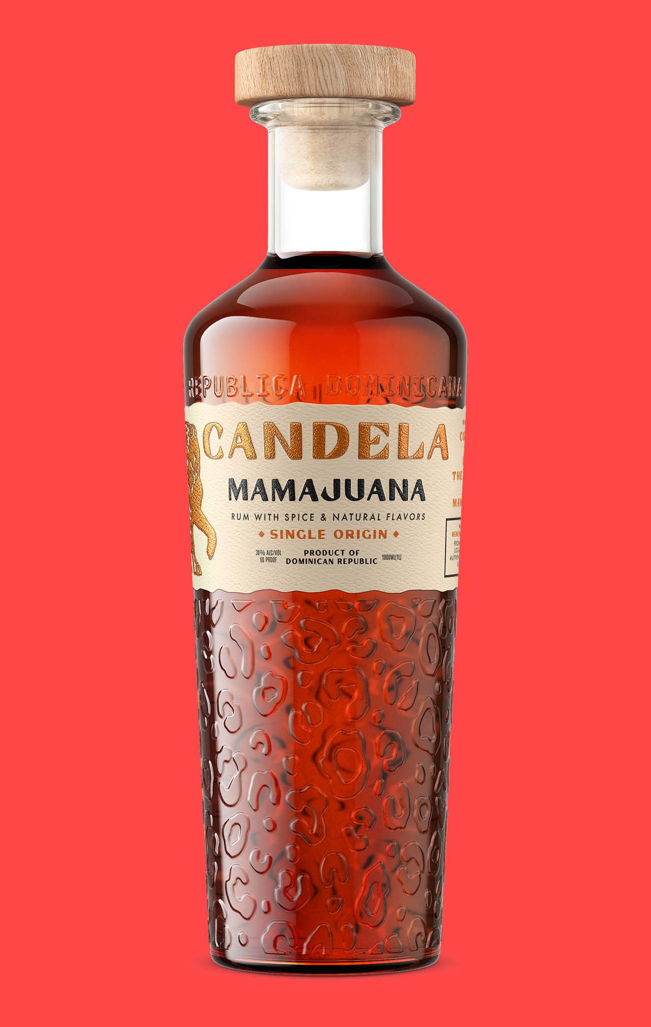
Retouching residual reflections
Even with a perfect setup, you will almost always have residual reflections to clean up. Most professional bottle photography is roughly half shooting and half retouching. A handful of techniques do most of the work in post.
Cleaning up label hot spots
The label takes the most attention. The standard pro technique splits the image into two layers: one for the smooth color and tone of the label, one for the fine texture and print detail. The bright reflection gets painted out of the smooth layer, while the texture layer stays untouched, so the label keeps its print quality.
In Photoshop this is called frequency separation. The name is intimidating. The idea is not: clean the smooth part, leave the detail part alone.
Clone stamping for stray glare
Small, hard specular points (a fleck of bright light on the shoulder, a hot pixel on a glass closure) come out with clone stamping. Sample a clean area of glass next to the reflection and paint it over the bright spot.
This works well on small, hard reflections. It is less convincing for large, soft reflections that bleed across the curve.
Wine color matching
Wine inside a bottle reads differently than wine in a glass. Light passes through the side of the bottle, which compresses the color and shifts the hue. A red that looks ruby in the glass can read flat purple-black through a 750ml bottle, especially when the glass is thick or the punt is deep.
A good retoucher matches the visible wine color to a reference: a known good bottle shot of the same wine, a label proof, or a photograph of the wine itself. The fix is usually a color-curves adjustment on just the liquid area, pulled toward whatever the brand owner accepts as “their” red, white, or rosé.
This step is almost always needed when you photograph the same wine on different days or under different lighting setups. Without it, a series of bottles drifts visibly out of sync.
Color consistency across a series
Bottles photographed on different days, even with the same setup, pick up subtle color casts on the glass and the label. Use color-curves adjustments to bring a series back into visual alignment before sign-off.
A good retoucher with a strong reference image can save a mediocre shoot. They cannot save a shoot that lacks the foundational shape and form of the bottle, which is determined by the lighting on the set.
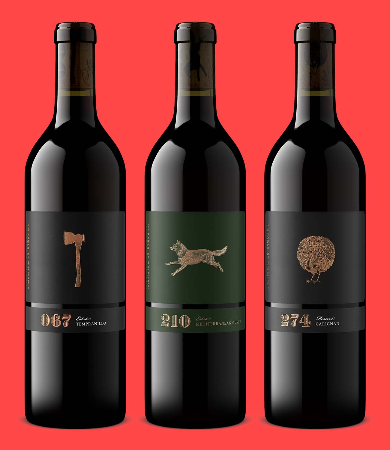
Hire a pro versus DIY shoot
Here is the honest math.
What a pro beverage photographer charges
A pro beverage photographer prices per bottle, and the rate moves with market, complexity, and usage rights. Wine is a genuinely difficult product to light, so beverage rates sit above general ecommerce product photography.
Add shipping a physical bottle to their studio, two to four weeks of turnaround from brief to final delivery, and a round or two of retouching feedback.
The real cost of DIY
DIY costs less per bottle on paper. In practice, the real costs add up.
A starter studio setup (lights, modifiers, a sweep frame, a tethering rig, a polarizer, a camera that handles glass well) runs $2,000 to $5,000. Add Photoshop and Lightroom subscriptions, plus the hours you spend learning what every commercial photographer figured out by year five.
Then there is inconsistency across SKUs, which is the single most common complaint we hear from wineries that tried to shoot in-house.
When DIY makes sense
DIY makes sense if you are a single-SKU brand with a creative founder who already shoots well.
It makes much less sense once you have eight labels, two vintages per year, and a distributor asking for clean catalog images by next month.
Hire a pro when you have a hero image to nail, a campaign that depends on a single perfect shot, or packaging complex enough that an experienced glass photographer is the right answer. For everything else, the math has shifted in the last few years.
The CGI alternative, in plain terms
A growing number of beverage brands have stopped photographing their bottles entirely. Not because the photographers got worse. Because the alternative got faster, cheaper, and more flexible.
How a 3D bottle shot is built
The idea is simple. Instead of shooting a physical bottle, a trained 3D artist builds a photorealistic model of it.
The model knows the exact mold of the bottle, the closure, the label artwork, and the surface finish. From that model, you can generate a bottle shot from any angle, with any lighting, on any background, in any composition.
No camera, no physical studio, no shipping physical samples. And no reshoot when the vintage changes.
This is what Outshinery does. We are a virtual studio for the beverage industry, producing photorealistic bottle shots and packaging visuals for wine, beer, spirits, RTD, cider, and cannabis brands without a photoshoot.
Two products, two paths.

Outshinery Studio, the human-crafted path
Outshinery Studio is the premium, human-crafted path. A trained 3D artist builds your bottle from scratch, including the exact glass mold, the closure, the label artwork, and any specialty finishes (foil, embossing, deboss, varnish).
Studio handles complex packaging, hero shots, lifestyle compositions, vintage updates, and enterprise volume. There is a specialist behind every image, not an algorithm.
Most of the modeling work is already done before your project starts. The Studio container library holds more than 1,100 bottle models, plus hundreds of closures and a dozen-plus glass colors, and it keeps growing. If your bottle is already in the library, the artist starts from the correct mold rather than building the geometry from scratch.
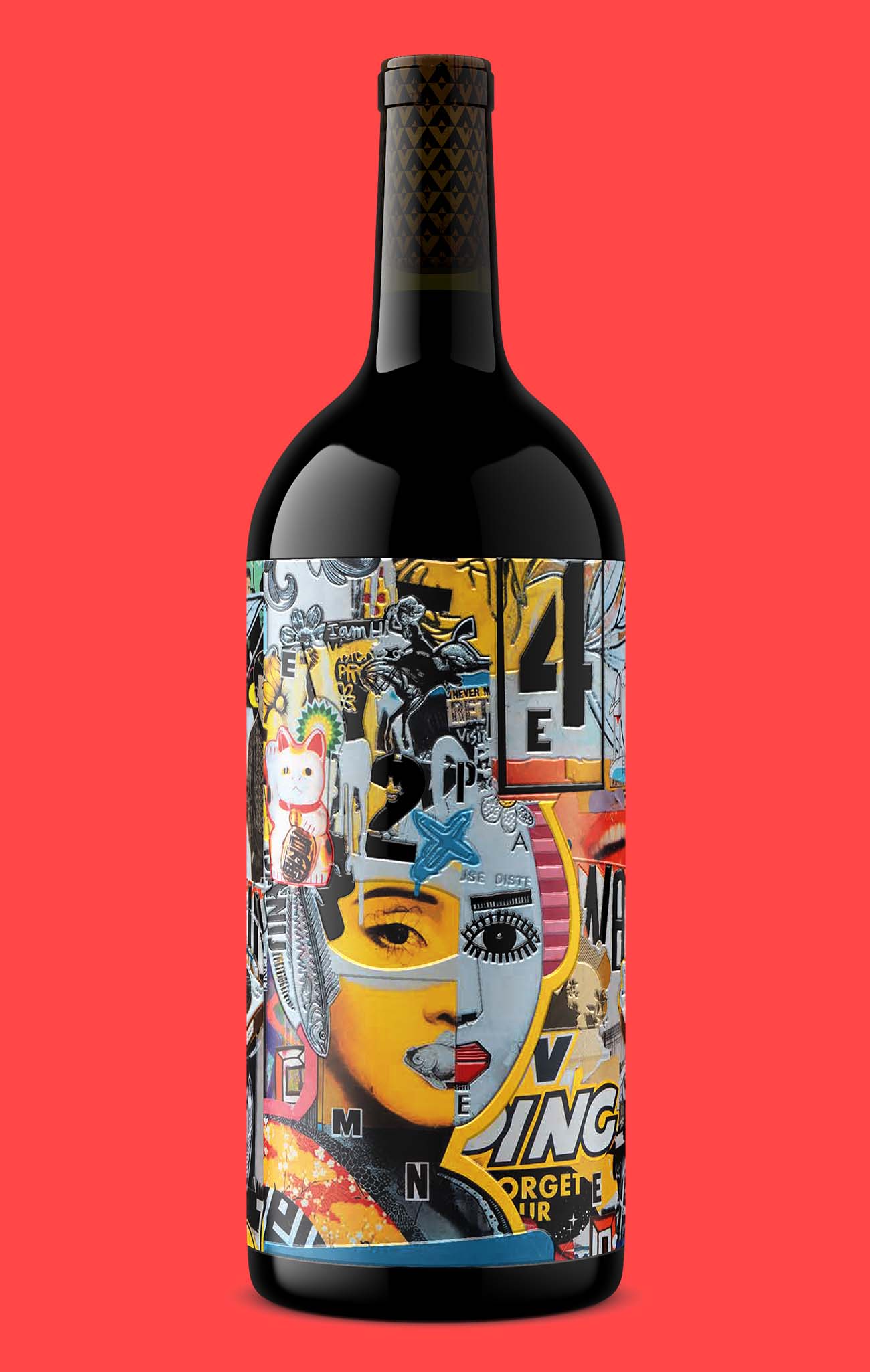
Outshinery Lite, the self-serve path
Outshinery Lite is the self-serve path for standard wine, cider and beer bottles. Upload your label, pick a container shape and closure from our library, get a photorealistic bottle shot in under an hour.
Lite is built for brands that need clean, consistent imagery fast and have packaging that fits a standard mold. The Lite library covers more than 15,000,000 bottle, closure, finish, glass color, and liquid combinations across wine, cider, and beer, all in glass bottles. Pricing is pay-per-order: $29 per image, dropping to $23 after ten orders. Every Lite order returns a transparent-background PNG at 2,160 pixels on the longest side.
Both produce results that are visually indistinguishable from traditional photography. The difference is that one ships in days, the other in under an hour, and neither requires a physical bottle.

Why pre-launch shots matter
The pre-launch advantage is the part beverage brands tend to underestimate. With CGI, you can have your bottle shot before the wine is even bottled, before the label is printed, and before the cork is in place.
That changes how you plan a launch, how you sell into distribution, and how you build a campaign calendar.
For Studio, the path is collaborative and built around production-grade detail. For Lite, the path is fast and built around standard bottle shapes. This walkthrough covers the automated path in detail. Either way, the reflection problem we have been working on for ten paragraphs simply does not exist, because there is no glass in front of a camera.
Frequently asked questions
How do you photograph a wine bottle without reflections?
You manage reflections rather than eliminate them. Use a soft, broad key light at forty-five degrees, a fill or reflector opposite, a rim light from behind, and a black flag close to the bottle on the side opposite your key. The black flag is what removes the milky look from dark glass, and a retouching pass cleans up the residual reflections no setup fully kills.
Best lighting setup for glass bottle photography?
A four-light setup: key, fill, rim, and negative fill. The key provides the main illumination, the fill softens the shadow side, and the rim defines the bottle edge against a dark background. The negative fill, a black card placed close to the bottle, absorbs stray light and creates the deep blacks that make glass read as professional rather than washed out.
Do polarizing filters eliminate reflections on bottles?
No. Polarizers reduce specular reflections on clear glass and glossy labels, but they have limited effect on foil capsules, metallic finishes, and the surface of dark liquids. For heavy foil or varnished labels, cross-polarization (polarizer on the light source plus polarizer on the lens) is more effective, though it removes the natural sheen of the glass and usually requires rebuilding highlights in post-production.
How much does a professional bottle shot cost?
Traditional beverage product photography typically runs $100 to $300 per image once production costs are included, with roughly $150 a common US average. Glass adds to that, because bottles take longer to light than opaque packaging and usually need a retouching pass on top. For comparison, Outshinery Lite is $29 per image and $23 after ten orders, with no studio, no shipping, and no physical bottle. Outshinery Studio is priced separately for human-crafted work on complex packaging.
How long does it take to photograph a bottle in-house?
A first-time DIY shoot of a single bottle usually takes a full day, including setup, test shots, the shoot itself, and an initial retouching pass. An experienced in-house team can produce a clean bottle shot in two to four hours. For comparison, Outshinery Lite produces a photorealistic bottle shot in under an hour, with no setup required and no physical bottle involved.
Can you produce a bottle shot before the wine is bottled?
Yes, but not with a camera. CGI bottle photography uses a 3D model of the container, the closure, and the label artwork, which means the bottle shot can be produced before the wine is in the bottle, before the label is printed, and before the cork is in place. This is one of the most useful capabilities for brands planning pre-launch campaigns, sell-in materials, or distributor pitches.
Design visuals that hold up across every channel. See how Outshinery Studio handles complex packaging, or try Outshinery Lite for standard wine bottle shots.
Quick-reference setup checklist
- Use a large, soft key light. Bigger softbox, softer highlights.
- Add a fill light or reflector opposite the key, dialed down by one to two stops.
- Add a rim light from behind to separate the bottle from the background.
- Use negative fill (a black card) on the side opposite the key to create clean blacks on the glass.
- Choose your background with care. Pure white sweep for ecommerce, gradient for editorial.
- Use a polarizer for glossy labels and clear glass. Cross-polarize for heavy foil if you have the gels.
- Plan the retouching pass before the shoot, not after. Clean up label hot spots, clone out stray glare, color-match the wine and the series.
- Shoot tethered. You will see reflections on the screen that you miss in the viewfinder.
- Reference a high-quality bottle shot of a similar bottle before you start. It anchors what good looks like.