What “good enough” actually means in beverage visuals (and why it’s not enough)
The compounding harm of subpar product shots

In the fast-paced world of beverage alcohol, speed is often the enemy of perfection. When you are rushing to launch a new SKU, expanding into a new market, or scrambling to get tech sheets ready for distributors, the temptation to cut corners is overwhelming.
We’ve all been there. You have a new vintage ready, but the professional photography isn't back yet. So, you snap a photo on a smartphone, or you use a mockup that "sort of" looks like the final glass colour. You tell yourself, "It’s good enough for now."
But here is the hard truth: in a digital-first marketplace, "good enough" is usually code for "invisible."
As brands scale, the definition of visual quality changes. It is no longer just about having a pretty picture; it is about consistency, psychological impact, and the ability to convert a browser into a buyer without them ever tasting a drop.
The speed of perception
Why does visual quality matter so much? Because your customers are judging your product faster than they can read your label.
Decades of vision research show that people can grasp the overall meaning or “gist” of a complex scene in well under one‑tenth of a second, often with exposure times around 100 milliseconds or less. At the same time, a large portion of the brain’s cortex is devoted to processing visual input, and multiple lines of work suggest that vision engages a substantial share of our neural resources, even if no single, precise percentage is universally agreed upon.
Before a consumer reads your tasting notes, before they check the ABV, and certainly before they read your brand story, they have already formed an opinion based solely on the image.
If your bottle shot looks flat, inconsistent, or amateurish, the brain immediately categorizes the product as lower quality. You are not just fighting for attention; you are fighting biology.
The high cost of inconsistency
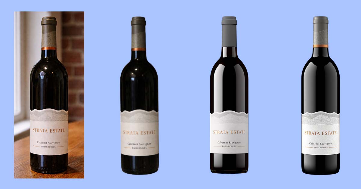
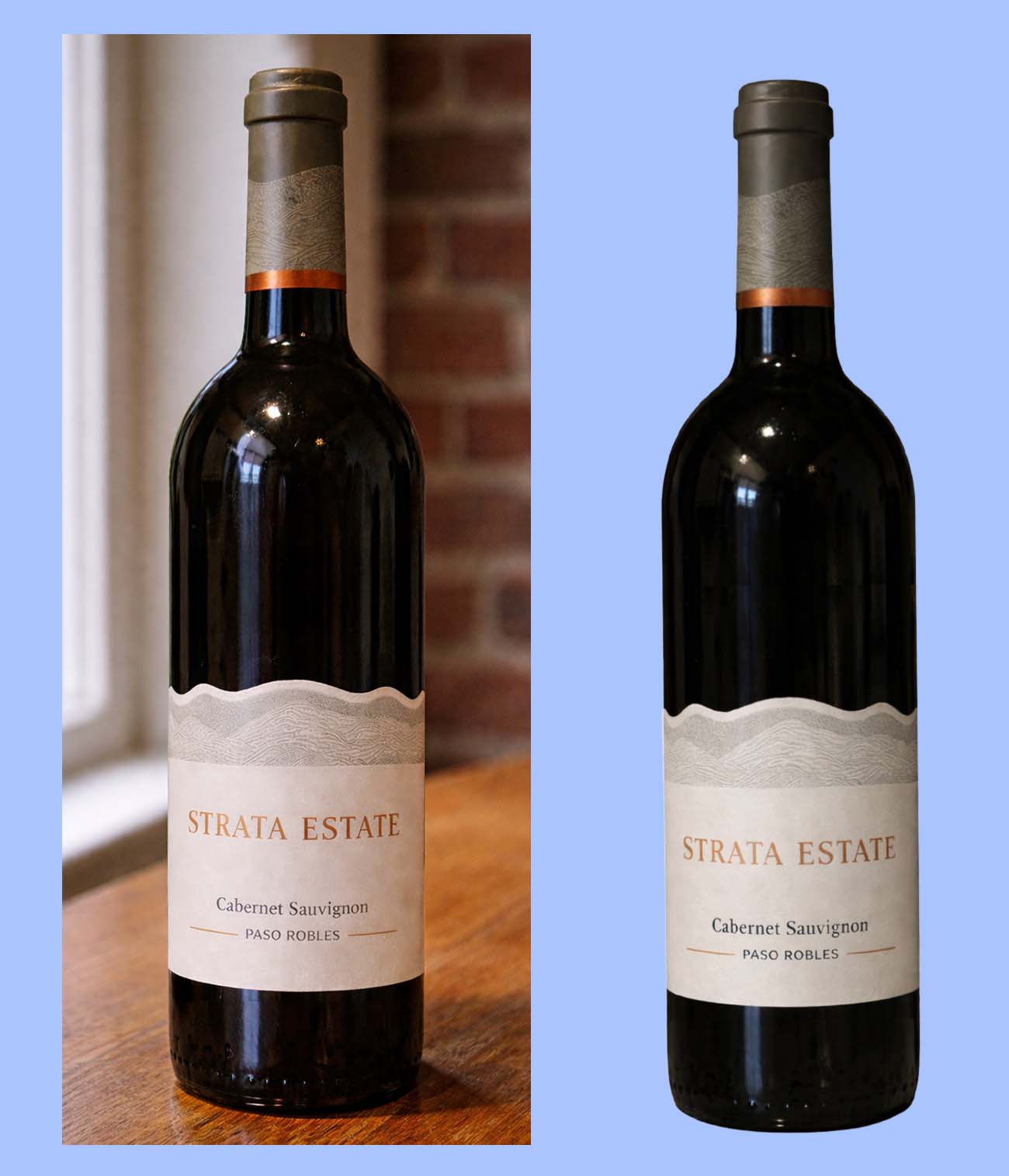
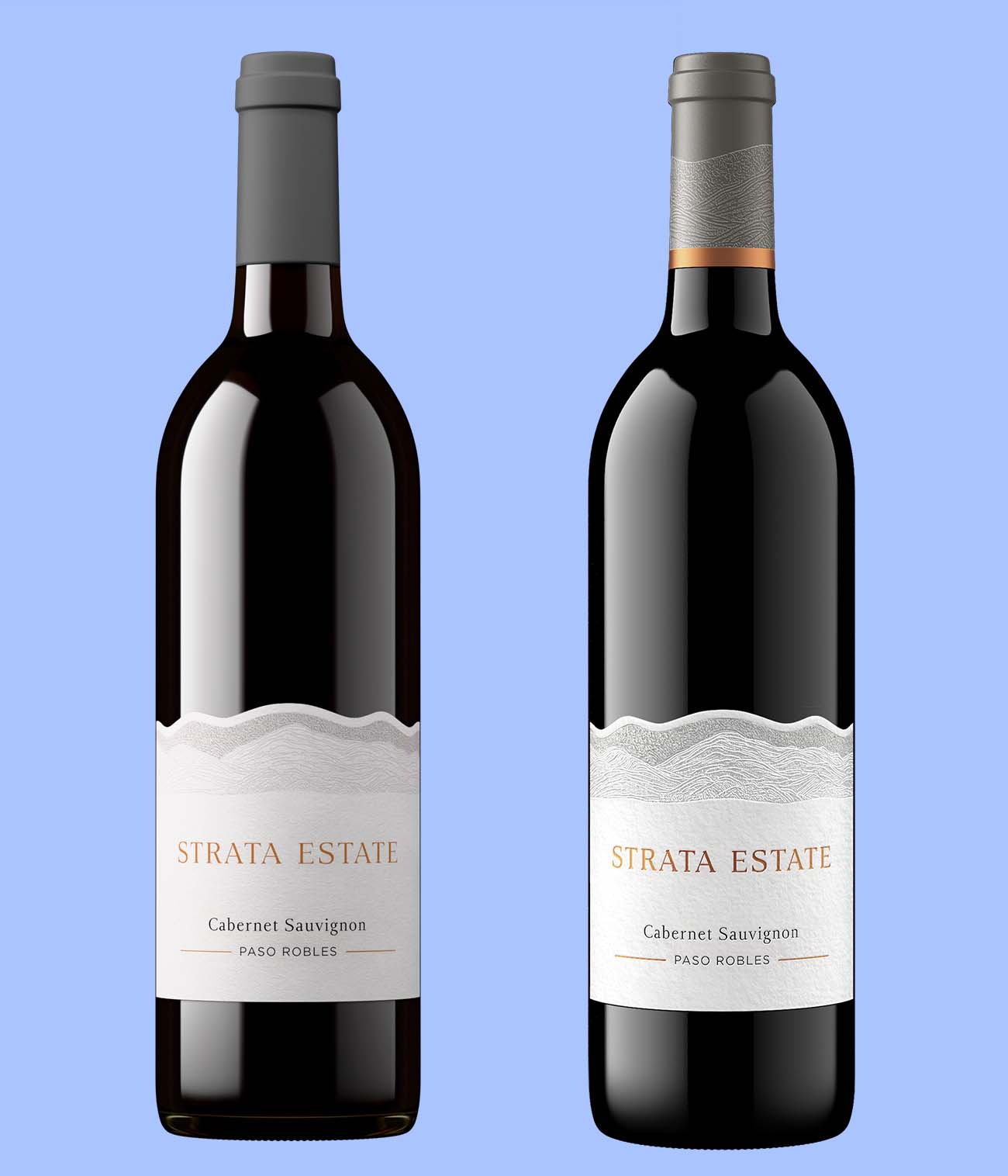
The biggest trap fast-growing brands fall into is visual inconsistency. I see this constantly: the flagship Cabernet has a stunning, high-budget studio photo, but the new Rosé is represented by a poor-quality mockup that lacks realism, and the limited-run blend is a slightly blurry phone photo taken against a warehouse wall.
When viewed together on a digital shelf (whether that’s Uber Eats, Vivino, or your own website) this lack of cohesion dilutes your brand identity. It suggests a lack of attention to detail.
Consumers notice. Consumers notice. In one Etsy survey, 90% of shoppers said that product photo quality is “extremely important” or “very important” in deciding whether to complete a purchase. If your imagery isn’t uniform, you’re not building brand recognition: you’re building hesitation.
The digital shelf is the only shelf
For many of your customers, the digital representation of your bottle is the product. They cannot pick it up to feel the weight of the glass or run their fingers over the embossed label. They have to trust what they see on a screen.
The stakes are incredibly high. Salsify’s 2025 consumer research found that 61% of shoppers identify product images and videos as the single biggest factor when deciding whether to complete a purchase.
If your visuals are merely "good enough," you are actively losing sales to competitors who understand that the image is the primary driver of conversion. A mediocre image suggests to the consumer that the liquid inside is mediocre, too.
Redefining "good enough"
So, if "good enough" is failing us, what should we be aiming for? For modern, scalable beverage brands, the new standard requires three things:
- Photorealism: The image must be indistinguishable from a physical photo. It needs perfect lighting, accurate liquid color, and texture that pops.
- Consistency: Every SKU, from your entry-level cans to your reserve tier bottles, must look like they belong to the same family. The lighting angles and shadows must match perfectly.
- Agility: You cannot wait weeks for a photographer to fit you into a schedule. You need assets before the glass even comes off the production line.
Settling for good-enough shots does not just hurt conversion, it triggers the rework cycle it creates every time a vintage, label, or distributor asset changes.
This is why I founded Outshinery. We realized that traditional photography simply cannot keep up with the demands of fast-growing beverage companies. By utilizing 3D technology, we eliminated the need for shipping bottles, scheduling shoots, and hoping for good weather.
Stop compromising
It is time to retire the "good enough" mindset. In a crowded market, your visuals are your loudest voice. They are the difference between a scroll-past and a click-through.
You don't need to break the budget to achieve perfection, but you do need to embrace a smarter way of working.
Rethink what ‘good enough’ really means for your brand.
For standard bottle shots where speed and consistency matter, self-serve tools like Outshinery Lite are designed to produce photorealistic visuals quickly, without the overhead of traditional photography.
When bottles, labels, or finishes require a higher level of control, such as unusual shapes, complex print techniques, or premium presentation, Outshinery Studio exists to capture those details with care and precision.
The goal is not more images.
It is visuals that hold up consistently, wherever your product is seen.


