Common product image mistakes on ecommerce sites
Most beverage brands are making the same visual errors on their online listings. Here is what to fix first.


A shopper lands on your product page. They have never tasted your wine. They have never visited your tasting room. They have never heard of your brand.
The image is the entire pitch.
In the time it takes to read this sentence, that shopper has already formed an opinion based on what they see. Research from ecommerce platforms consistently shows that over 90% of online shoppers cite image quality as the most important factor in their purchase decision.
And yet, the same image mistakes appear on beverage ecommerce listings everywhere. Not because brands do not care, but because the problems are easy to create and hard to notice from the inside.
The wrong background for the channel
This is the single most common compliance failure on marketplace listings. Amazon requires a pure white background for main product images. Vivino works best with transparent backgrounds. Retailer portals have their own specifications. Your DTC site might use a lifestyle context or a styled background.

The mistake is using the same image file everywhere. A bottle shot with a gray studio background might look fine on your own website but will get flagged or rejected on Amazon. A transparent PNG uploaded to a platform that requires white will sometimes render with a black or checkerboard background, making the listing look broken.
The fix is not complicated, but it requires having your product images available in multiple formats from the start. If your original photography was shot on one background, every other format requires post-production editing.
Inconsistent lighting across the portfolio
Open a winery's online shop and scroll through the product grid. If the images were shot by different photographers, at different times, or in different locations, the inconsistency is immediately visible.
One bottle has warm, soft lighting. The next has harsh shadows. A third looks slightly overexposed. The labels have different color temperatures. The angles do not match.
Individually, each image might be acceptable. Together, they look like products from different brands. And 54% of shoppers have abandoned a purchase because content was not consistent across channels, according to Salsify's 2025 consumer research.
This problem compounds over time. Each new vintage, each new photographer, each new SKU adds another visual style to the library. The inconsistency is cumulative.

Low resolution that kills the zoom
Most ecommerce platforms offer a zoom function on product images. Shoppers use it, especially for wine and spirits where label details matter. The vintage year, the appellation, the producer name, the varietal, the alcohol percentage. These details drive purchasing decisions.
If the image resolution is too low, the zoom reveals blur instead of detail. On Amazon, the minimum for zoom functionality is 1,000 pixels on the longest side, but 2,000 pixels is recommended. Vivino and Wine.com have similar thresholds.
The mistake is uploading images that meet the minimum but fall short of what actually works. A 1,000-pixel image technically displays, but it cannot be zoomed. The shopper cannot read the label. They move to the next listing.
Resolution problems compound on mobile. Overly compressed files turn label details into blocks of color. Test your product images on a phone before publishing. If you cannot read the appellation on a mobile screen, neither can your customer.

Only one image per product
Major retail and marketplace channels increasingly require or strongly recommend multiple product views. Amazon's best practices suggest at least five images. Instacart and grocery retail portals want front, back, and sometimes group shots.
Most wineries have one decent bottle shot and nothing else. When a retail partner or marketplace requests additional views, the brand scrambles. They go back to the photographer, attempt DIY, or delay the listing.
Each delay is lost revenue. A retail slot that goes live without proper imagery underperforms from day one. And the impression it makes on the buyer who listed you is not one that invites repeat business.
Outdated vintage on the listing
This is the mistake that erodes trust most quietly. A product page shows the 2022 vintage label, but the wine being shipped is the 2024. The shopper does not know this until the bottle arrives.
For casual buyers, this is confusing. For collectors and serious wine shoppers, it is a dealbreaker. And it is the kind of mismatch that generates returns, negative reviews, and lost repeat purchases.
The underlying cause is almost always the same: updating product images is expensive and time-consuming when it requires a new photoshoot. So brands delay. They plan to update after harvest. Then after bottling. Then after the next release. The image stays wrong for months.
Poor cropping that wastes the frame
Product images should fill the frame. The bottle or package should occupy 85% or more of the image area. Too much empty space around the product makes it look small, unimportant, and lost in the listing grid.
This is especially visible on mobile devices, where screen real estate is limited. A bottle that fills 40% of the frame on a phone screen is competing against listings where the product dominates the thumbnail.
The fix is straightforward: crop tighter. But if the original image was not shot with ecommerce framing in mind, recropping can introduce new problems, like cutting off the closure or losing label detail at the bottom.
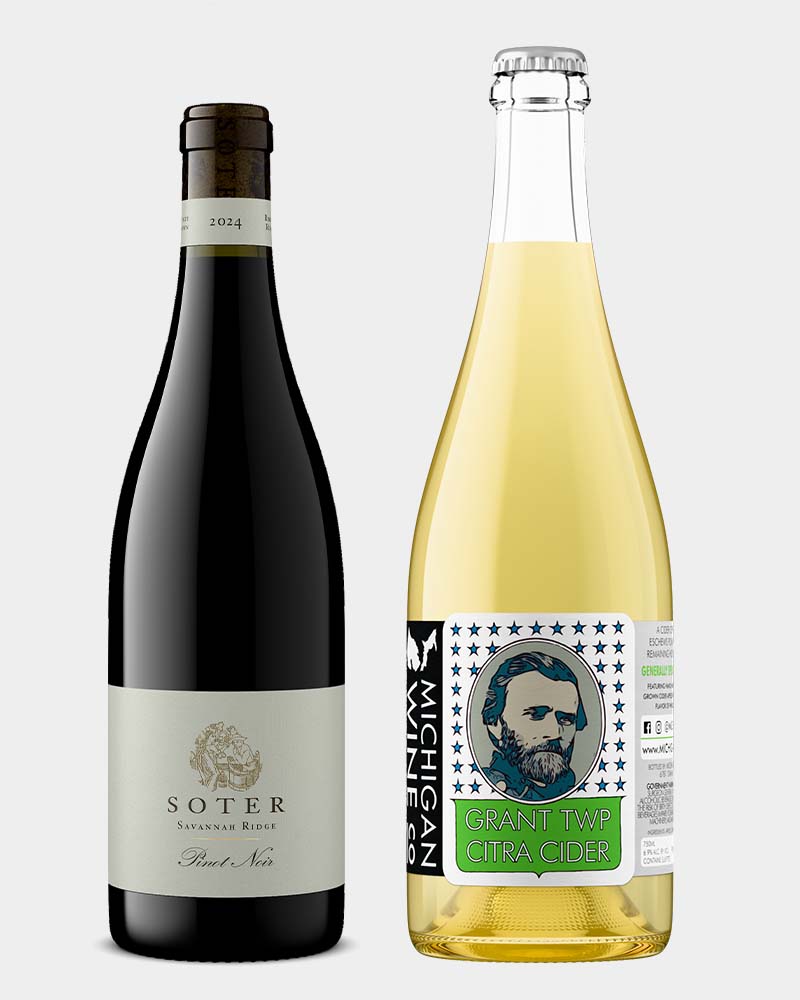
Inconsistent bottle scale in group shots
When you show multiple products together, bottles that should be the same height appear different sizes. A side-by-side of two 750ml bottles where one looks visibly smaller destroys credibility.
Scale inconsistency suggests careless production, or that you are mixing product lines without making it clear. Either way, the shopper notices.
The fix is to render or photograph bottles of the same size at genuinely identical scale. If sizes vary intentionally, make that obvious in your product information so the image matches the reality.

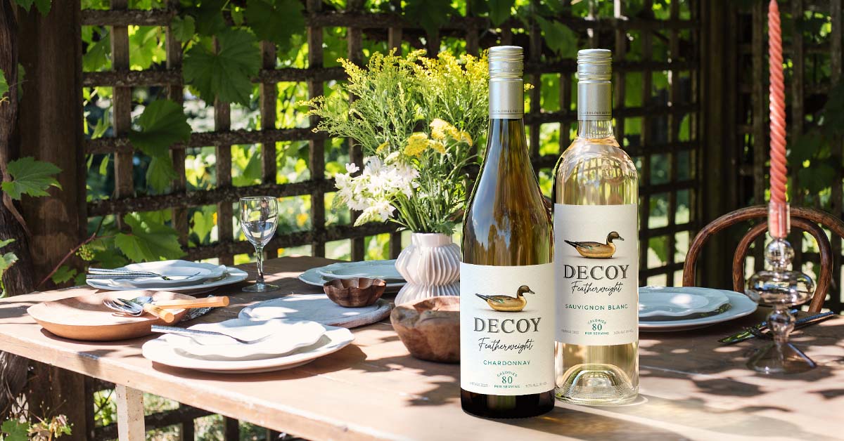
No lifestyle or context images
A clean product shot is necessary. It is not sufficient.
Shoppers increasingly expect to see products in context. A wine bottle on a dinner table. A spirits bottle in a cocktail setting. A can in someone's hand at an outdoor event. These images help the shopper picture the product in their own life, which is a meaningful conversion driver.
The gap exists because lifestyle photography is expensive and complex to produce. It requires a set, props, sometimes models, and a skilled photographer. For a small or mid-size brand, this is a budget item that gets cut first.

Building an image library that works
The common thread in every mistake above is the same: the image production process was not designed for the demands of multi-channel ecommerce.
A single photoshoot, with one background, one format, and one set of dimensions, cannot serve a DTC site, three marketplaces, a distributor portal, and social media simultaneously. The rework required to adapt those images, or the decision to skip it, is what creates the problems listed here.
The brands that avoid these mistakes are the ones that build their image library as a system, not a project. Every product rendered once, correctly, in a format that can be adapted to any channel without starting over.
How Outshinery prevents these mistakes
Outshinery Studio produces photorealistic 3D renders from a permanent digital model. Every image comes from a controlled environment with consistent lighting, angle, and background treatment. The output is channel-ready by default: transparent PNG, white background JPEG, high resolution for zoom, all from the same source asset. When a vintage updates, the label is swapped on the existing model. Days, not weeks.
Outshinery Lite gives wine brands the same consistency in a self-serve format. Upload a label, choose a bottle shape, receive a photorealistic PNG within about an hour. Every Lite image uses the same studio-quality lighting and framing, so your entire portfolio looks cohesive from the first order.
Both products are built to eliminate the exact mistakes that cost beverage brands sales every day on their ecommerce listings.

Quick audit: check your listings right now
- Open your top-selling product on your DTC site, Amazon, and Vivino
- Does the image show the current vintage year?
- Can you zoom in and read every word on the label?
- Does the background match the channel's requirements?
- Do all your products in the grid look like they belong to the same brand?
- Do you have more than one image per product?
If any answer is no, those listings are underperforming right now.